Preview image. Unlock full-res
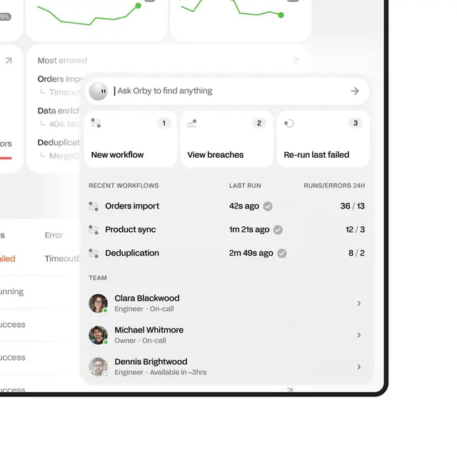
A data dashboard showing workflow jobs, recent runs, and team status in a light card-based layout with a search bar, action buttons, and inline metrics.
Summary
A SaaS monitoring dashboard displaying active workflows, recent job runs with timestamps and success rates, and team member status in a light, neutrally-colored card interface.
Visual description
The layout is built on large, distinct white cards floating on a light gray background. At the top is a rounded search bar with text "Ask Orby to find anything" (suggesting an AI assistant feature). Below are three action cards labeled "New workflow," "View breaches," and "Re-run last failed" with numeric badges (1, 2, 3). The main content area shows a "RECENT WORKFLOWS" section listing three items (Orders import, Product sync, Deduplication) with run times (42s ago, 1m 21s ago, 2m 49s ago) and success/failure counts to the right (36/13, 12/3, 8/2). Below that, a "LAST RUN" column and "RUNS/ERRORS 24H" column provide additional detail. At the bottom, a "TEAM" section displays three team members with profile photos, names, roles (Engineer, Owner), and availability status (On-call indicators). Faint line charts appear in the upper background, suggesting trend data. The color palette is off-white, light gray, and dark gray text with green checkmark indicators.
Key takeaway
The modular card system lets complex operational data sit side by side without visual chaos. The "Ask Orby" pattern (AI-assisted search) is a modern way to handle discovery in data-heavy interfaces. The consistent use of small timestamps and success/failure ratios gives operators the health signal they need without text. The team roster placed at the bottom acts as a natural call-to-action for responsibility and context.
Reuse notes
Ideal for B2B SaaS monitoring, analytics, or DevOps platforms where operators need to glance at job status, run history, and team availability. The muted color palette keeps the focus on data and status indicators rather than decoration. Works best with consistent iconography (checkmarks, status badges) to signal states at a glance. The card-based separation is excellent for breaking operational domains (workflows, errors, team) without tabbed navigation.
More like this



Keep what you find
A free account saves references to boards and can send you a weekly email of picks based on what you save.
To see every result, go Pro.