Preview image. Unlock full-res
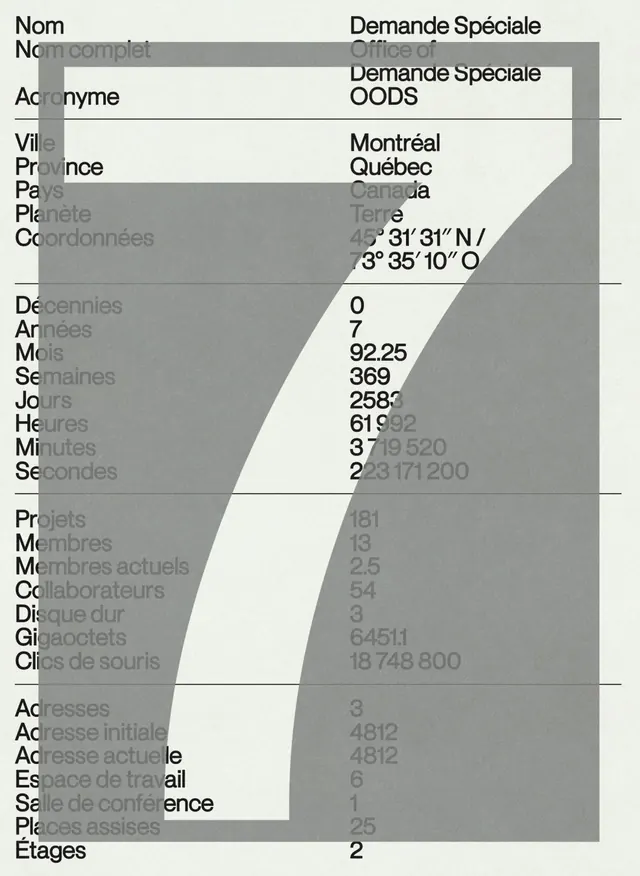
Administrative data table using monochrome typography, tabular structure, and geometric overlays to organize organizational and quantitative information.
Summary
An administrative data table using strict two-column layout with field labels on the left and corresponding values on the right, separated by horizontal dividers and overlaid with geometric white and gray rectangular shapes.
Visual description
A portrait-oriented table layout rendered in monochrome gray (charcoal, medium gray, pale cream). The left column contains French administrative labels (Nom, Acronyme, Ville, Province, Coordinates, Decades, Years, Months, Weeks, Days, Hours, Minutes, Seconds, Projects, Members, Addresses, etc.) in black sans-serif type, left-aligned and separated by thin horizontal rule lines. The right column displays corresponding numerical values and data points, also in black sans-serif. Large geometric white and pale gray rectangles are layered over portions of the table, creating a sense of editorial emphasis or data filtering. These shapes occupy perhaps one-third of the visible content, creating a dynamic, slightly playful overlay against an otherwise utilitarian design. The overall effect is professional and clean, balancing informational density with visual breathing room.
Key takeaway
The two-column field-value structure itself, which scales well for organized data entry and reference materials; the use of geometric overlay shapes as a visual callout technique, drawing attention to specific data areas without color or additional typography; and the balance between dense information and visual rest through strategic white space and layering.
Reuse notes
Ideal for administrative tools, databases, forms, organizational charts, or technical documentation where clarity and scanability matter. The geometric overlay technique works particularly well for highlighting key metrics or sections. The monochrome palette ensures readability in print and digital contexts. Best suited for B2B, research, or data-driven organizations. Could adapt the overlay technique to highlight different sections or create visual hierarchy in repetitive tabular layouts.
More like this


Keep what you find
A free account saves references to boards and can send you a weekly email of picks based on what you save.
To see every result, go Pro.