Preview image. Unlock full-res
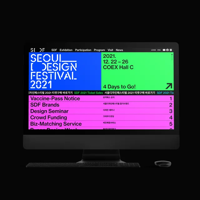
A high-contrast dark event dashboard showing festival schedule and information in neon-accented color blocks stacked vertically.
Summary
A dark event dashboard for Seoul Design Festival 2021 using high-contrast neon color blocks to organize festival programs, dates, and venue information into scannable sections.
Visual description
A mock computer monitor displays a pure black background with a horizontal navigation bar at the top showing text in a narrow sans-serif font (Korean and English typography). Below, vertically stacked horizontal bars alternate among four neon colors: bright cyan blue, hot magenta pink, lime green, and black. Each colored band contains white text in a tight, condensed typeface with festival information, dates (October 8-24), session names, and event categories. A green section highlights "4 Days to Go!" and key venue/event information. The magenta section lists program offerings (Vaccine Press Notice, SDF Brands, etc.). Text is left-aligned within each band with consistent generous padding. The overall impression is urgently modern and digitally native, optimized for rapid scanning.
Key takeaway
Stacking full-width colored bars creates strong visual separation between information blocks while the high contrast ensures fast readability even at small sizes. The neon color selection signals modernity and energy without requiring illustration or photography. Consistent text sizing and padding within each band allows viewers to quickly parse dense event information. Using narrow, condensed typography maximizes content density while condensed letterforms enhance the technical, contemporary feel.
Reuse notes
Excellent template for event management interfaces, software dashboards, and any digital product needing to display dense tabular or categorical information. The neon-on-black scheme works best for tech, media, gaming, and creative industry audiences. Very effective on mobile screens where full-width bands naturally stack and scale. The high contrast ensures WCAG compliance. Avoid if your audience expects a warm or approachable tone; the neon palette reads clinical and technical.
More like this


Keep what you find
A free account saves references to boards and can send you a weekly email of picks based on what you save.
To see every result, go Pro.