Preview image. Unlock full-res
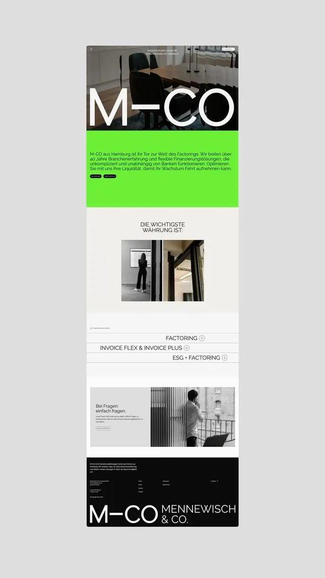
A corporate B2B website using stark black-and-white photography with a vibrant neon-green banner, bold sans-serif typography, and minimal layout to convey financial professionalism.
Summary
A corporate factoring company website (M-CO) using a bold neon-green band with body copy to interrupt grayscale photography, paired with white display typography and minimal layout.
Visual description
A multi-section website layout for a German B2B financial services company. The visual hierarchy alternates between full-bleed black-and-white photography (office interior, conference room setup) and content sections. A distinctive neon-green (#6DEF35) horizontal band contains German body copy and navigation elements, creating a vibrant interruption against the monochromatic palette. Large white sans-serif typography (all-caps) displays the company name "M-CO" overlaid on a photograph, establishing strong brand presence. Lower sections show additional photography paired with minimal text descriptions and accordion-style service listings. A dark footer with white text provides contact and legal information. The overall composition maintains strict geometric alignment with clean margins and whitespace, emphasizing restraint and corporate authority.
Key takeaway
A single neon accent color punches through a grayscale palette without needing variation. The alternating rhythm of photography and text breaks potential monotony while preserving minimalist discipline. White display type on photographic backgrounds reads clearly when positioned decisively (large scale, high contrast).
Reuse notes
Effective for B2B fintech, consulting, and corporate identity work where authority and clarity outweigh warmth. The neon accent works because it is confined to supporting elements, not spread throughout. Best suited to companies serving other businesses rather than consumer audiences. High-impact photography is essential; this approach fails with weak imagery.
More like this


Keep what you find
A free account saves references to boards and can send you a weekly email of picks based on what you save.
To see every result, go Pro.