Preview image. Unlock full-res
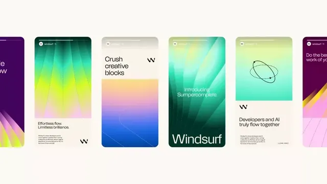
Six rounded card designs showcasing a design system with tetradic-color gradients, minimalist sans-serif type, and modular compositional framework.
Summary
Six rounded rectangular cards arranged horizontally, each featuring a vibrant tetradic-color gradient background with overlaid sans-serif headlines and descriptive text, demonstrating a modular design system.
Visual description
Six equal-width, tall rounded cards arranged in a horizontal row on a light beige background. Each card displays a distinct gradient: purple-to-magenta on the left; teal-to-lime-yellow in the center-left; soft beige-to-orange-to-pink in the middle; lime-yellow-to-teal on the center-right; and teal-to-yellow-green on the far right. Partial card at far left shows purple-to-pink, partially cropped. Each card contains a sans-serif headline in bold dark or light text and smaller body copy. Some cards feature simple line illustrations (e.g., a dotted orbital circle, bracket symbol). The Windsurf logo appears on multiple cards. Consistent padding and alignment create a cohesive, modular visual language. The composition demonstrates typography hierarchy and color progression across a unified system.
Key takeaway
The tetradic-color gradient approach applied consistently across a modular card system. The use of simple line iconography to break visual repetition without cluttering. The clear spatial hierarchy: bold headline, body text, optional icon, all aligned within the card bounds.
Reuse notes
Ideal for portfolio sites, design system documentation, and creative-services marketing. The card module scales well to different grid widths and can be used to showcase individual features or team capabilities. The vibrant gradients pair well with creative or tech-forward brands; the minimalist type treatment keeps the system feeling controlled. Consider using for product feature breakdowns or design case studies. The system assumes sufficient vertical space; crops awkwardly on narrow viewports.
More like this



Keep what you find
A free account saves references to boards and can send you a weekly email of picks based on what you save.
To see every result, go Pro.