Preview image. Unlock full-res
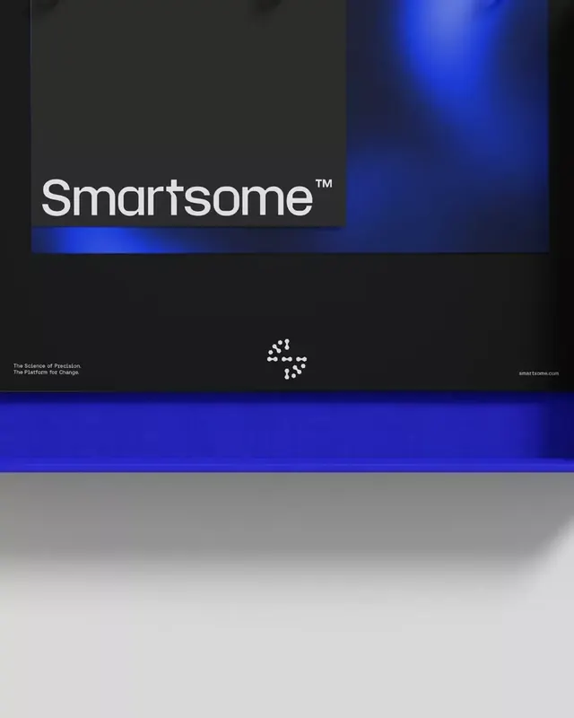
A tech brand identity featuring the 'Smartsome' wordmark in white sans-serif on a dark field, anchored by a vibrant electric-blue gradient band and minimal icon.
Summary
Smartsome brand identity: white sans-serif wordmark against a charcoal ground, divided by a bright electric-blue gradient band with a geometric icon below.
Visual description
Vertical composition split into upper dark zone and lower blue gradient zone. The wordmark "Smartsome" in white sans-serif with a trademark symbol sits left-aligned in the upper half against a dark charcoal-to-black field. A horizontal electric-blue radial gradient band (bright center fading to deep indigo at the edges) separates the two zones. Below sits a minimalist white geometric icon (composed of small dots forming an abstract connection pattern). Secondary copy reads "The Science of Precision. The Platform for Change" in small white sans-serif on the left, and "smartsome.com" in the lower right. No additional ornamentation; the gradient acts as the primary visual accent and divider between brand identity (top) and platform claim (bottom).
Key takeaway
The horizontal gradient as a visual divider is elegant and directional, creating movement without animation. The contrast between crisp wordmark geometry and the soft gradient bloom is sophisticated. The minimalist geometric icon below adds technical credibility without cluttering. This layout works well for B2B SaaS identity materials or software-platform hero sections.
Reuse notes
Strong for fintech, developer tools, or enterprise platforms needing to convey both trust and innovation. The dark background and electric-blue gradient set a premium, high-tech tone. Works equally well in vertical or horizontal layouts; may need adjustment if the gradient band needs to adapt to wider screens.
More like this







Keep what you find
A free account saves references to boards and can send you a weekly email of picks based on what you save.
To see every result, go Pro.