Preview image. Unlock full-res
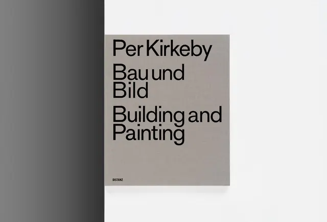
A minimalist Swiss-style book cover for "Bau und Bild" (Building and Painting) by Per Kirkeby, featuring clean typography on a neutral background.
Summary
A Swiss-minimalist book cover for Per Kirkeby's "Bau und Bild" with large sans-serif type in German, set on a neutral taupe background with white negative space.
Visual description
The cover is divided into two distinct areas: a light gray-white left portion and a taupe-beige right section. On the taupe section, bold sans-serif type is arranged in a stacked, unjustified layout reading "Per Kirkeby / Bau und Bild / Building and Painting" with bilingual typography (German and English). A small publisher mark ("DISTANZ") sits in the lower corner. The overall composition is spare and geometric, emphasizing the relationship between type and whitespace. No decorative elements or imagery are present, creating a purely typographic composition.
Key takeaway
The power of typography alone to convey sophistication and design intent. The split-field background creates visual rhythm without pattern or ornament. Bilingual placement (German/English) reads as intentional and scholarly. The sparse layout emphasizes each word's weight.
Reuse notes
Excellent reference for art books, design publishing, and educational contexts. Works well for German or Central European design sensibilities. The neutral palette appeals to sophisticated, minimalist brands. Best paired with thoughtful typography choices and generous whitespace. Not recommended if a bright, energetic, or decorative aesthetic is needed.
More like this





Keep what you find
A free account saves references to boards and can send you a weekly email of picks based on what you save.
To see every result, go Pro.