Preview image. Unlock full-res
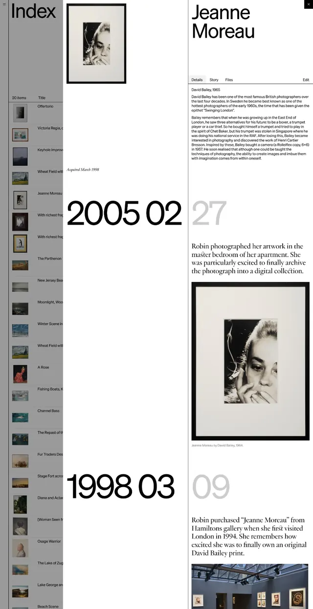
A stark monochrome archive index page (photographer Jeanne Moreau) using a left-side color-swatch palette and centered chronological date markers (2005, 1998) with framed black and white portrait photographs and justified body copy.
Summary
A monochrome gallery archive page for photographer Jeanne Moreau organized by chronological date markers, framed photographs, and dense justified copy, with a color-swatch palette on the left edge as the only chromatic element.
Visual description
A white vertical layout with a left-margin color-swatch palette (gray, beige, and tonal squares) serving as the sole navigational or categorical device. The main content is centered and white, with generous margins. At top, a small framed black and white portrait photograph of Jeanne Moreau is set flush-left above the heading "Jeanne Moreau" in large sans-serif. Below is a multi-paragraph justified text block in a small sans-serif, giving historical or biographical context. Two large chronological date entries are prominent: "2005 02" in bold black, "27" in light gray to the right, then below another date cluster "1998 03" in bold, "09" in light. Each date is accompanied by smaller body copy and another framed black and white photograph. The entire layout bleeds white space, emphasizing the photographs and minimal typography. No color is visible except the left-side palette swatches and pure black text and rules.
Key takeaway
The left-margin color swatch palette as a quiet indexing device that adds nuance without disrupting monochrome austerity. Chronological organization paired with large date numbers creates scannable hierarchy. Framed photographs are consistently proportioned and positioned, creating rhythm. Justified, dense body copy communicates authority and documentary rigor without making the page feel crowded because of ample white space.
Reuse notes
Ideal for portfolio, gallery, or academic archival contexts where chronology and photography are primary and color is subordinate. Works well for biographies, exhibition catalogs, or historical documentation. The swatch palette suggests a curatorial or conservation angle without being literal. Avoid for fast-scanning consumer content; this layout rewards close reading. Pairs well with serif typefaces for even greater formality, though the sans-serif here signals contemporary design thinking.
More like this


Keep what you find
A free account saves references to boards and can send you a weekly email of picks based on what you save.
To see every result, go Pro.