Preview image. Unlock full-res
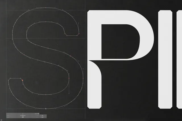
A technical type specimen showcasing the construction of the letter 'S' via vector paths alongside a bold, solid white letter 'P' and parts of other letters.
Summary
A technical type specimen showcasing the construction of the letter 'S' via vector paths alongside a bold, solid white letter 'P' and parts of other letters.
Visual description
The left side features a thin white vector outline of the letter 'S' with anchor points and grid lines on a dark background. The right side displays large, solid white, condensed sans-serif letterforms, specifically a 'P' and portions of adjacent letters.
Key takeaway
Use technical construction lines and grids to demonstrate the geometric precision and mathematical structure of a typeface.
Reuse notes
Use this style when presenting brand guidelines or typeface specifications to emphasize design rigor and structural integrity.
More like this



Keep what you find
A free account saves references to boards and can send you a weekly email of picks based on what you save.
To see every result, go Pro.