Preview image. Unlock full-res
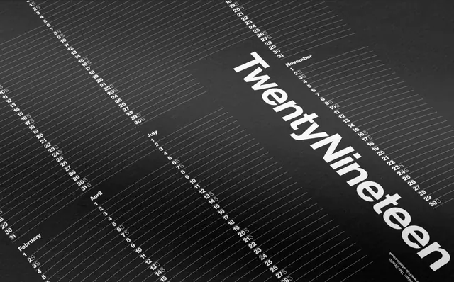
A monochromatic, data-dense typographic composition featuring the word 'TwentyNineteen' overlaid on a structured grid of monthly date sequences.
Summary
A monochromatic, data-dense typographic composition featuring the word 'TwentyNineteen' overlaid on a structured grid of monthly date sequences.
Visual description
The large, white sans-serif wordmark 'TwentyNineteen' is set at an angle across the frame. Beneath it, multiple rows of small, white numbers representing calendar dates are arranged in diagonal, parallel lines against a dark, textured background.
Key takeaway
Using oversized typography as a structural element over a dense, repetitive data grid creates a sense of depth and scale.
Reuse notes
Use this style for high-end editorial covers or branding that needs to convey a sense of time, order, or technical precision.
More like this

Keep what you find
A free account saves references to boards and can send you a weekly email of picks based on what you save.
To see every result, go Pro.