Preview image. Unlock full-res
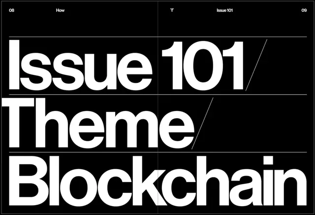
An editorial magazine spread with large bold sans-serif type announcing "Issue 101" and "Theme: Blockchain" on a black background.
Summary
A high-contrast editorial layout with bold sans-serif type announcing an issue theme, laid out in a stacked, left-aligned configuration on solid black.
Visual description
The composition is a magazine spread viewed across two facing pages. The background is pure black. At the top, minimal grid lines and page numbers (08, 09) and headers ("How", "Issue 101") in small sans-serif type establish the grid structure. The dominant content is bold white sans-serif letterforms arranged vertically and left-aligned: "Issue 101 / Theme / Blockchain" with strategic line breaks. The type is geometric and modern, with generous letterforms and consistent stroke weight. A diagonal line slashes through the layout after "101", adding compositional interest and breaking the strict alignment. The overall grid and hierarchy are clearly legible despite the minimal aesthetic. No imagery or decoration is present.
Key takeaway
Bold typography as the primary design element creates impact without imagery. Horizontal and diagonal lines create visual rhythm and guide the eye. Monochrome treatment emphasizes form and hierarchy over decoration. The grid structure (visible in headers and rules) signals editorial credibility.
Reuse notes
Strong for editorial design, magazine covers, and issue announcements. Works well for tech, cryptocurrency, and innovation-focused publications. The monochrome treatment is timeless and professional. The large type commands attention and works at small scale (thumbnails) as well as large. Excellent for social media teasers and email headers. Best paired with detailed body copy and supporting imagery. The blockchain/crypto subject matter is specific but the typographic approach is versatile. Avoid if seeking warmth or visual approachability.
More like this



Keep what you find
A free account saves references to boards and can send you a weekly email of picks based on what you save.
To see every result, go Pro.