Preview image. Unlock full-res
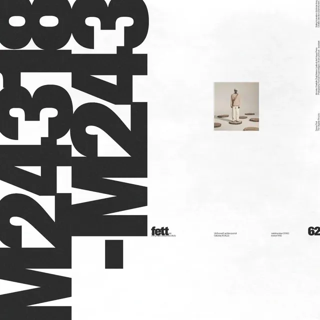
A graphic design magazine or publication cover featuring bold black geometric letterforms, a "fett" wordmark, and an inset photographic image of a figure against cream and white space.
Summary
A publication cover in classic Swiss design style with large-scale black geometric typography, a "fett" wordmark in lowercase, a small inset photograph, and page number "62" positioned in the lower right against a clean cream background.
Visual description
The cover is dominated by oversized black sans-serif letterforms arranged diagonally and layered across the composition, creating a dynamic rhythm through scale and overlap. A small rectangular photograph sits inset in the center-right area, showing a figure in neutral tones. Below the geometric type area, the lowercase word "fett" appears as the publication or section identifier. The page number "62" sits in the bottom right. The background is off-white or cream, giving maximum contrast to the black elements. Fine lines and small text appear in the margins, suggesting this is part of a larger publication or editorial system.
Key takeaway
Bold, oversized typography and monochrome contrast can organize a dense composition without hierarchy feeling chaotic—the geometric arrangement and clear wordmark anchor the design.
Reuse notes
Strong reference for editorial design, magazine covers, or publication systems requiring impact and legibility. The Swiss approach works for design-focused, art, and cultural contexts.
More like this









Keep what you find
A free account saves references to boards and can send you a weekly email of picks based on what you save.
To see every result, go Pro.