Preview image. Unlock full-res
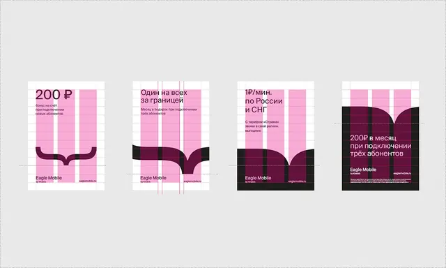
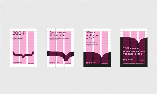
Four stacked pricing plan cards for Eagle Mobile, using bright pink grid layout and deep maroon footer bars with Cyrillic text.
Summary
A set of four subscription pricing cards for Eagle Mobile, each using bright pink grid columns with pricing and benefits, anchored by a deep maroon footer.
Visual description
Four vertically stacked rectangular cards on light gray background. Each card: bright pink grid of vertical columns occupying the upper two-thirds, with Cyrillic pricing text on left side and benefits listed below. Deep maroon/brown footer band spans the width, containing "Eagle Mobile" branding and logo (stylized "{s}" mark). Each card displays a different price point (200 P, "Один на всех", "1P/мин", and "200P в месяц") with supporting Russian-language copy. Maroon footer footers vary slightly in width and detail per card but maintain visual consistency.
Key takeaway
The stark split between energetic pink pricing area and restrained maroon branding footer creates instant visual hierarchy and guides focus to pricing. Grid columns in the pink section naturally segment pricing tiers and benefits.
Reuse notes
Strong template for subscription or tiered pricing displays. Pink draws the eye and suggests energy and approachability; the maroon grounds the brand. Works best for mobile services or consumer-facing SaaS. Avoid using this palette if the brand runs cool or luxury positioning.
More like this






Keep what you find
A free account saves references to boards and can send you a weekly email of picks based on what you save.
To see every result, go Pro.