Preview image. Unlock full-res
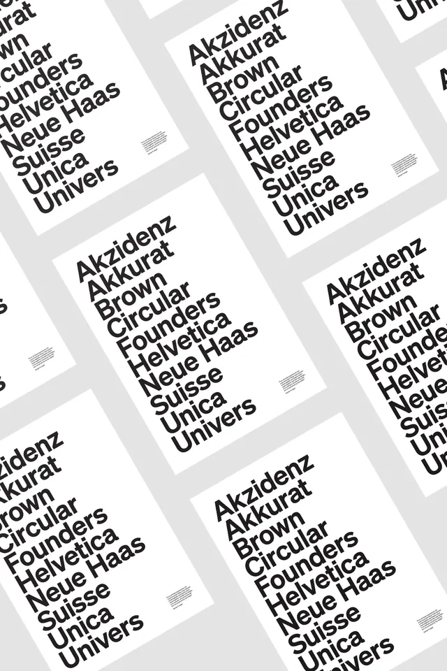
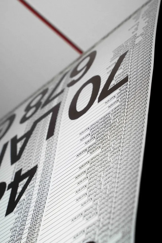
Specimen sheet displaying multiple typeface weights and styles arranged in a grid of overlapping cards with diagonal perspective.
Summary
A minimalist type specimen grid showcasing a sans-serif typeface family with overlapping card layouts printed at an isometric angle, emphasizing weight and style variations.
Visual description
Four printed specimen cards arranged in a diagonal overlapping grid against a light background. Each card displays the same typeface family name in bold sans-serif, accompanied by a list of weight names and foundry information rendered in much smaller type. Cards appear to be tilted at a consistent 3D perspective angle, creating visual rhythm. A light gray background with visible halftone texture appears beneath parts of the cards. White paper stock with clean typography and generous negative space gives a professional, design-forward appearance.
Key takeaway
Using isometric card perspective and white space to make a type specimen feel dynamic rather than static. The staggered arrangement and consistent angle treatment create visual interest while maintaining clarity and legibility of the typeface being displayed.
Reuse notes
Strong reference for modern type specimen designs and foundry presentations. The isometric perspective and overlapping card approach works well for showcasing font families with multiple weights. Best viewed at larger sizes to appreciate the type details. Adapt the perspective angle or colors for different typographic contexts.
More like this

Keep what you find
A free account saves references to boards and can send you a weekly email of picks based on what you save.
To see every result, go Pro.