Preview image. Unlock full-res
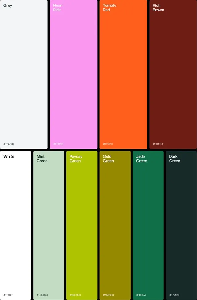
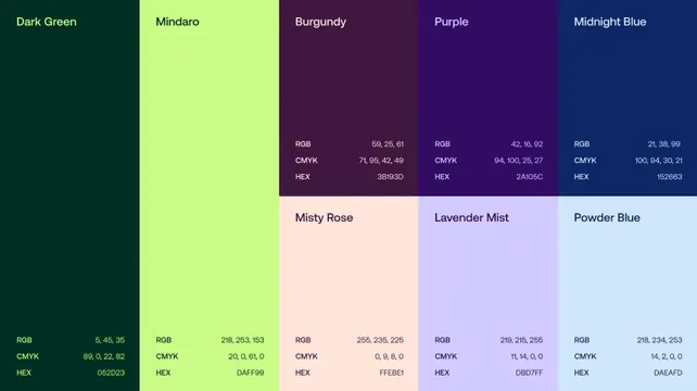
A vertical grid of rectangular color swatches organized into two rows, each labeled with a color name and a hex code.
Summary
A vertical grid of rectangular color swatches organized into two rows, each labeled with a color name and a hex code.
Visual description
The image features twelve vertical rectangular blocks arranged in two rows of six. Each block is a solid color with a small text label in the top left corner and a hex code in the bottom left corner. The colors range from light grey and white to neon pink, tomato red, rich brown, mint green, payday green, gold green, jade green, and dark green.
Key takeaway
Use a structured grid layout with clear labeling to present a cohesive color system.
Reuse notes
Use this format when creating brand guidelines or presenting color palettes to clients.
More like this

Keep what you find
A free account saves references to boards and can send you a weekly email of picks based on what you save.
To see every result, go Pro.