Preview image. Unlock full-res
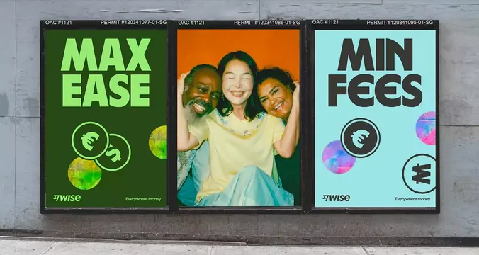
Three mounted street advertising posters for the Wise money-transfer service, each using solid neon backgrounds, large display typography, and one photographic centerpiece to emphasize service features.
Summary
Three identical-format street posters for Wise show neon color blocking (lime-green, orange, cyan) with oversized sans-serif typography and a central portrait, comparing fee structures and emphasizing simple money transfer worldwide.
Visual description
Three black-framed posters mounted on a light gray weathered wall, each with a dark top bar displaying permit numbers and OAC codes. The left poster uses a bright lime-green background with large white sans-serif text reading "MAX EASE" and stylized currency icons (euros and dollars) in circular white outlines, plus yellow-green geometric circles on the right edge. The center poster features a full-color portrait photograph of three smiling people in a warm interior setting, overlaid with "Local Legend" in large purple text and a phone number in orange. The right poster uses a cyan background with white sans-serif text "MIN FEES" and corresponding currency symbols in outlines plus watercolor-style circular shapes in purple and pink on the right. All three include the Wise tagline "Everywhere money" and logo. The typography is consistent, bold, and sans-serif across all three, prioritizing clarity and immediate readability from a distance.
Key takeaway
Neon solid backgrounds paired with minimal graphic elements (outlines, icons, watercolor shapes) create maximum impact without visual clutter. The large, white, all-caps typography ensures legibility from street distance. Placing a photograph in the center of a tripartite poster layout creates a focal point and humanizes a financial service. The consistent format and color system across three posters creates brand unity while each panel emphasizes a different messaging angle.
Reuse notes
Ideal for fintech or financial-service outdoor advertising where you need to communicate a value proposition quickly (low fees, ease, global reach). The neon palette reads strongly in daylight and from distance. The portrait photograph breaks up type-heavy layouts and adds social proof. Works best when the three-panel format (comparison) is central to your messaging. Scale this approach for other service-comparison scenarios (insurance, telecom, utilities).
More like this



Keep what you find
A free account saves references to boards and can send you a weekly email of picks based on what you save.
To see every result, go Pro.