Preview image. Unlock full-res
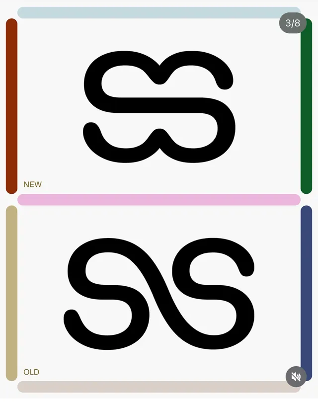
A white composition shows a thick black looping monogram-like form labeled with small NEW and OLD text and framed by rounded colored bars around the edges.
Summary
A white composition shows a thick black looping monogram-like form labeled with small NEW and OLD text and framed by rounded colored bars around the edges.
Visual description
The image is a white canvas with a thick black abstract monogram centered in the upper half and a similar smaller monogram centered below it. Rounded vertical and horizontal bars in muted pastel and earthy colors sit near the edges, with small labels reading NEW and OLD on the left side.
Key takeaway
Use a stark monochrome centerpiece against a quiet white field, then frame it with soft rounded edge bars to create a polished comparison-board feel. The contrast between the bold central form and the restrained border elements gives the layout immediate structure.
Reuse notes
This works well for brand evolution slides, logo explorations, or visual comparison pages where the main subject needs to feel editorial and intentional. It is especially effective when you want a minimal presentation that still feels designed rather than bare.
More like this


Keep what you find
A free account saves references to boards and can send you a weekly email of picks based on what you save.
To see every result, go Pro.