Preview image. Unlock full-res
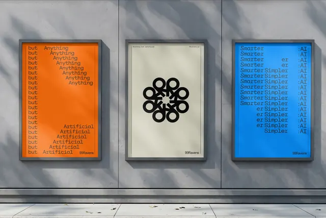
Three framed typographic poster variations are displayed side by side on a concrete wall, each using a different color field and minimalist layout.
Summary
Three framed typographic poster variations are displayed side by side on a concrete wall, each using a different color field and minimalist layout.
Visual description
Three vertically oriented framed posters hang on a gray concrete wall with strong diagonal shadows. The left poster is orange with repeated "but" and "Anything" text, the center poster is cream with a black circular emblem and small header/footer text, and the right poster is bright blue with repeated "Smarter" and ":AI" text.
Key takeaway
Use a strict three-panel series to explore one message through different typographic treatments and color fields. Keep the composition spare, with small headers and footers framing a dominant central idea.
Reuse notes
This works well for campaign posters, identity explorations, or editorial graphics where repetition and contrast do most of the work. It is strongest when the typography itself is the content and the surrounding environment can provide texture or shadow.
More like this



Keep what you find
A free account saves references to boards and can send you a weekly email of picks based on what you save.
To see every result, go Pro.