Preview image. Unlock full-res
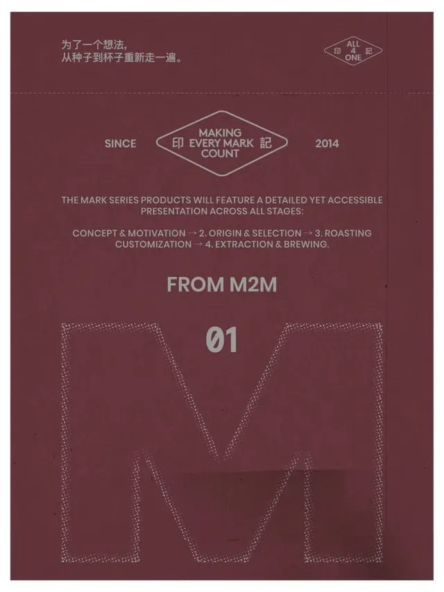
A maroon printed graphic with centered typography, diamond-shaped logo marks, and a large dotted-outline letter M at the bottom.
Summary
A maroon printed graphic with centered typography, diamond-shaped logo marks, and a large dotted-outline letter M at the bottom.
Visual description
The image shows a maroon printed page with pale gray text and linework arranged symmetrically down the center. Near the top are Chinese characters, small diamond logo marks, a centered logo lockup, a short paragraph of all-caps copy, and the label "FROM M2M" above a large outlined "M" built from dotted white marks.
Key takeaway
Use a strict centered hierarchy with a single oversized graphic form anchoring the bottom of the composition. Pair it with restrained all-caps typography and fine line logo elements to create a premium, print-like identity feel.
Reuse notes
This approach works well for brand posters, packaging, or launch graphics that need a minimal but tactile presentation. It is strongest on deep, muted backgrounds where light typography and thin outlines can carry the composition without extra imagery.
More like this


Keep what you find
A free account saves references to boards and can send you a weekly email of picks based on what you save.
To see every result, go Pro.