Preview image. Unlock full-res
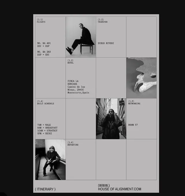
Magazine or publication layout using a four-column grid with black and white photography, minimal typography, and generous white space to organize diverse editorial content.
Summary
Magazine layout demonstrating a modular four-column grid organizing black and white photography and minimal typographic labels into an editorial hierarchy.
Visual description
Black background with a light gray grid containing nine cells arranged in a 4-column structure. Cells vary in size, with asymmetric divisions creating visual rhythm. Four black and white photographic images (person seated on chair, abstract light/shadow study, person in motion, figure reading) occupy roughly half the grid cells. Text labels in small all-caps sans-serif appear within or below images, including page references ("ITINERARY," "PAGE 27," "BOOK 37," "HOUSE OF ALIGNMENT.COM"). Thin white dividing lines separate cells, creating clear modular zones. Generous negative space (unpopulated grid cells) balances photographic and typographic density.
Key takeaway
The asymmetric grid proportioning creates visual interest without symmetrical formality; the restricted palette (black/white/gray) lets photography dominate while keeping focus; sparse typography labeling suggests functionality and curation rather than explanation.
Reuse notes
Ideal for editorial, publishing, and portfolio work where photography or visual hierarchy is primary. The grid discipline conveys curatorial taste and professional rigor. Works especially well when images have strong compositional clarity and when you want typography to be subordinate to visuals.
More like this








Keep what you find
A free account saves references to boards and can send you a weekly email of picks based on what you save.
To see every result, go Pro.