Preview image. Unlock full-res
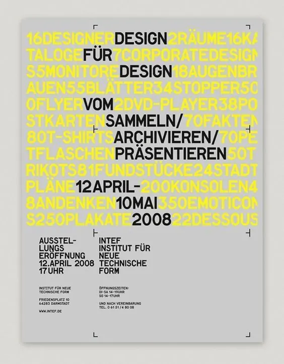
A 2008 institutional poster layering overlapping yellow and black sans-serif text in a Swiss modernist grid, promoting a design exhibition opening April 12.
Summary
A Swiss modernist exhibition poster from 2008 layering bright yellow and black sans-serif text in a dense grid composition promoting an Institute opening, anchored by structured event details at the bottom.
Visual description
Light gray background with dense, overlapping typography in all-caps sans-serif. Bright yellow text and black text interweave throughout the composition, creating visual rhythm through figure-ground reversal. Event title, dates, and venue information "DESIGN BRAUME" and related text cascade down the poster. At the bottom, a structured information block in smaller sans-serif type presents event details: exhibition opening date April 12, institute name, address, and website in disciplined alignment. The composition employs negative space sparingly, prioritizing typographic density and contrast to create impact and visual interest through layering and weight variation.
Key takeaway
Stack and overlap sans-serif typography in complementary high-contrast colors to create visual depth without illustrations. Use a modular grid to anchor dense information hierarchies at the base while allowing expressive layering above. Bright accent color (here, bright yellow) against black and gray creates legibility and dynamism simultaneously.
Reuse notes
Strong approach for cultural institution posters, design event promotion, and minimalist editorial work where type is the primary graphic element. The layering technique demands confident typographic pairing and works best with clearly differentiated type sizes and weights. Suits institutional and nonprofit design where budget precludes illustration.
More like this
Keep what you find
A free account saves references to boards and can send you a weekly email of picks based on what you save.
To see every result, go Pro.