Preview image. Unlock full-res
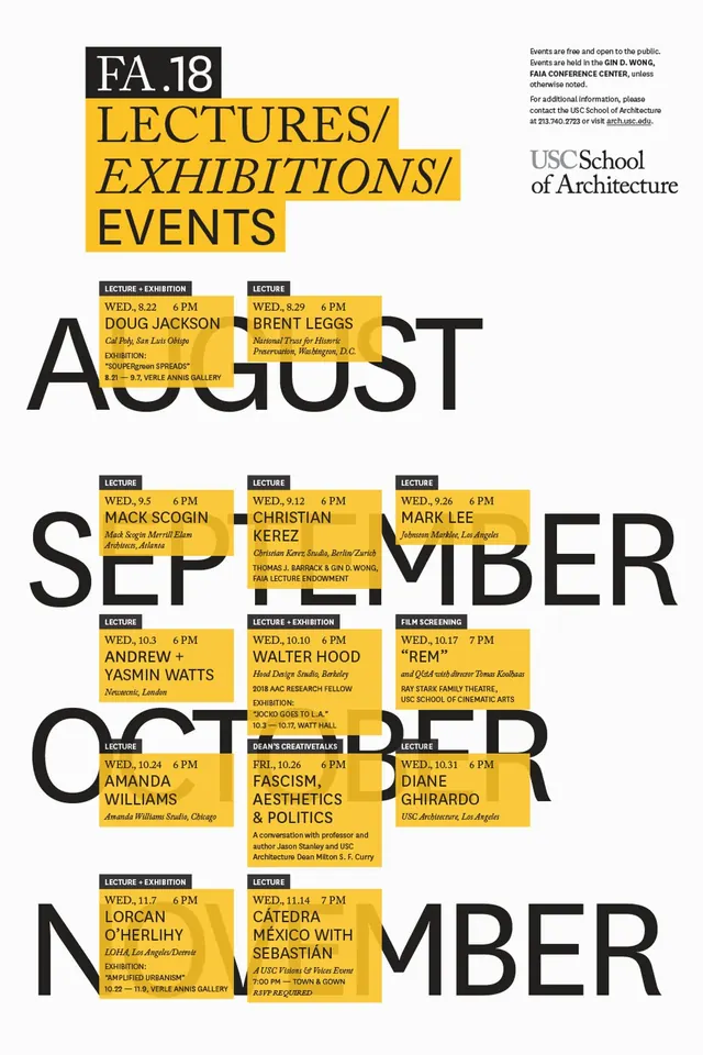
Bold architectural school poster with oversized black sans-serif type interlocked with a grid of yellow event-information blocks listing speakers and dates.
Summary
A USC Architecture event poster using massive black sans-serif type for month names with yellow information blocks grid-locked around and within the letterforms, each block naming a speaker, date, and time.
Visual description
Vertical poster with centered title "FA.18 LECTURES/EXHIBITIONS/EVENTS" and USC School of Architecture wordmark at the top. A repeating pattern unfolds down the page: the words AUGUST, SEPTEMBER, OCTOBER, and NOVEMBER are set in massive, condensed black sans-serif (possibly grotesque style), and embedded within and between these letters are stacked rectangular blocks in bright yellow. Each yellow block carries small black type listing a speaker name, date, time (e.g. "MON 3-5 PM"), location or event type (DOUG JACKSON, BRENT LEGGS, CHRISTIAN FABIAN). The yellow blocks act as modular containers breaking up the dense letterforms, creating a rhythm that integrates content directly into typography. Pure white background, high-contrast black and yellow palette, consistent sans-serif throughout.
Key takeaway
Merging the calendar/schedule function directly into the primary typography so type and content are one visual move. The modular yellow blocks can be moved, grouped, or scattered within/around letterforms without losing legibility, turning a poster into an indexable grid. This approach works for event-heavy institutions where announcing many speakers at many times needs to feel unified, not cluttered.
Reuse notes
Strong for architecture schools, design conferences, and institutional event calendars. Works best when you have enough events to justify the modular yellow-block rhythm; sparse calendars may read as disconnected. The massive type takes real commitment to paper or screen real estate and works better in portrait or landscape contexts where there is vertical space to stack months.
More like this

Keep what you find
A free account saves references to boards and can send you a weekly email of picks based on what you save.
To see every result, go Pro.