Preview image. Unlock full-res
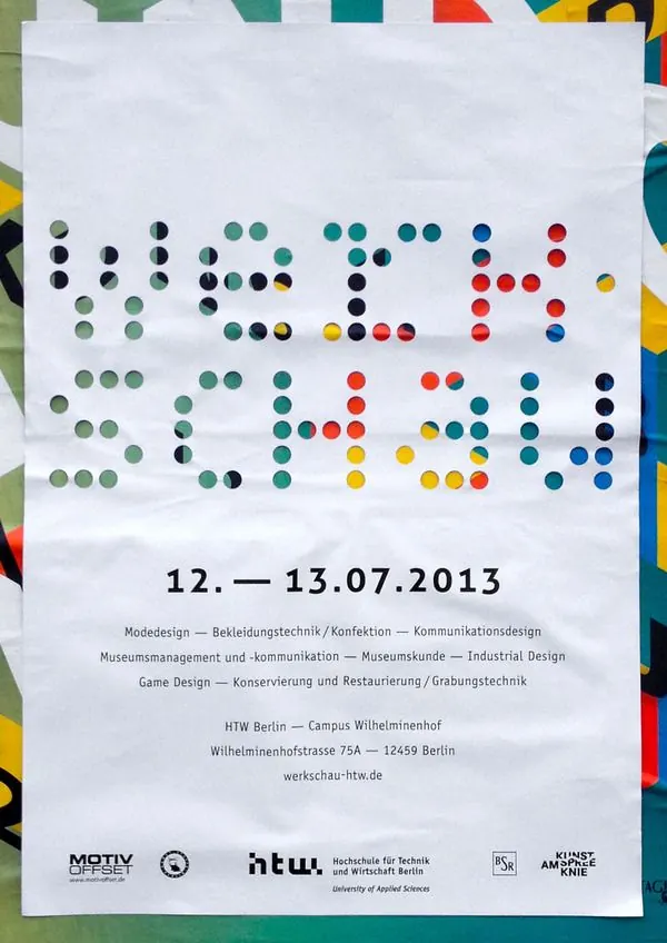
Conference poster using colored dots arranged in a pixel grid to spell out the event date and information, layered over a vibrant abstract background.
Summary
A poster for an HTW Berlin design conference announces the event date in large colored dots arranged like a pixel grid, with venue and topic information stacked below in smaller text.
Visual description
White background with no margin. The upper half features rows of small colored dots arranged in a regular grid, forming letters and numbers in a pixel-art style. Each dot is a solid circle roughly 12-15mm in diameter, with rows spaced evenly and columns aligned. The colors progress through the spectrum: greens and teals dominate the left and center sections, reds and yellows occupy the right side, with occasional navy blue accents woven through. Each color fills a specific letter or word in the date string. Below the dot pattern, black sans-serif text lists the event theme, disciplines covered, hosting institution, address, and website. Small sponsor logos (including MOTIV, HTW Berlin, and Kunstknie) anchor the bottom. The composition reads as a unified poster suitable for wall mounting.
Key takeaway
The dot-matrix approach turns typography into a visual play without sacrificing legibility. Organizing the colors by position (progressing left to right) adds rhythm and guides the eye naturally. Using dots instead of filled glyphs creates an approachable, inviting tone that still reads as professional and design-forward. This technique is memorable and Instagram-friendly without being gimmicky.
Reuse notes
Ideal for educational institutions, design conferences, and creative-industry events where playfulness and technical credibility must coexist. Works well for posters, invitations, and event collateral where the date is the hero. Color progression can be tuned to match institutional branding. The grid structure makes it scalable: scale the dots and spacing proportionally and the design remains readable at any size. Best on white or very light backgrounds to maximize contrast.
More like this
Keep what you find
A free account saves references to boards and can send you a weekly email of picks based on what you save.
To see every result, go Pro.