Preview image. Unlock full-res
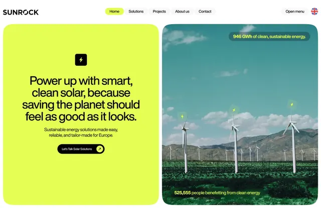
Lime-green hero panel with bold copywriting contrasts a teal photographic landscape of wind turbines, split vertically with navigation bar and data callout.
Summary
A split-screen hero contrasting a lime-green text panel with an expansive landscape photograph of wind turbines, framed by a navigation bar and a teal data callout.
Visual description
The layout divides vertically in half. Left panel uses bright lime-green background with sans-serif black headline "Power up with smart, clean solar, because saving the planet should feel as good as it looks." Below, a smaller copy line in black introduces the company value proposition, followed by a dark pill-shaped button. Right panel displays a wide-angle photograph of white wind turbines across rolling green fields under blue sky with white clouds. A teal-green banner with white text sits at top-right, stating "946 GWh of clean, sustainable energy." Yellow lightning-bolt icons float throughout the composition. The top navigation bar shows "SUNROCK" logo, menu items, and a language toggle.
Key takeaway
Lime-green against neutral grounds creates immediate visual pop and brand distinction. The split balances bold typography and aspirational landscape photography. Data callouts (GWh figures, beneficiary count) ground sustainability claims in tangible impact. Icons add personality without competing for attention.
Reuse notes
Strong template for clean-energy, B2B sustainability, or climate-tech brands. The split composition accommodates long-form value copy on one side while photography on the other works harder for emotional connection. Works particularly well when pairing technical data with landscape or environmental imagery. The lime-green works best for companies targeting European or millennial audiences with optimistic, forward-thinking brands.
More like this

Keep what you find
A free account saves references to boards and can send you a weekly email of picks based on what you save.
To see every result, go Pro.