Preview image. Unlock full-res
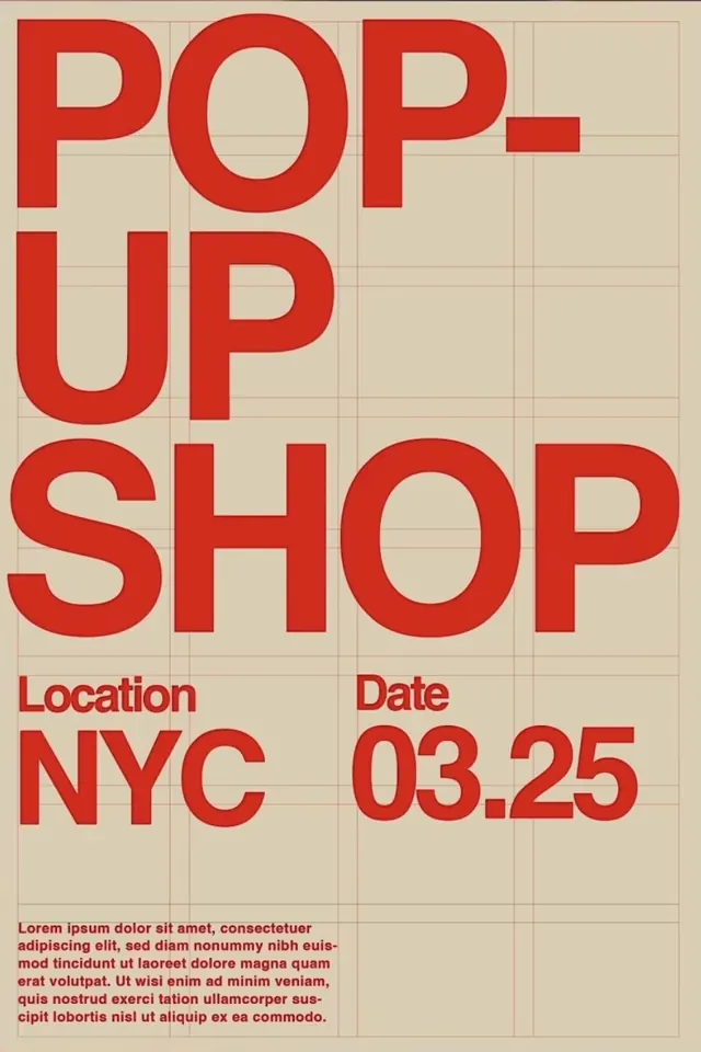
A retro event poster layering oversized red sans-serif typography over a subtle tan grid, with location and date details anchored at the bottom.
Summary
A pop-up shop event poster using oversized red sans-serif capitals stacked on a tan grid, with location and date set below in smaller red text and justified body copy.
Visual description
A vertically stacked typographic poster on a cream-tan background overlaid with a visible grid of tan lines (roughly 10x12 cells). The headline "POP. UP SHOP" is rendered in bold, heavy sans-serif capitals in bright red, with each word or pair stacked to fill the upper two-thirds of the composition. Below, in smaller red type: "Location NYC" and "Date 03.25", flanked by the grid. At the bottom, a block of justified red body copy (Lorem ipsum) sits in a justified column. The grid provides structure and visual depth without competing with the large, direct letterforms.
Key takeaway
The grid background gives authority and structure to what could otherwise feel chaotic from large-scale stacking. The bright red against a warm neutral ground creates urgency without harshness. The proportional scale drop (large caps to small details) guides the eye naturally through the hierarchy and makes the key information (event, location, date) instantly legible.
Reuse notes
Ideal for retail, events, and promotions that need to feel both modern and assertive. The visible grid works for Swiss-style or modernist brands; works less well for soft or organic aesthetics. The red-on-tan combo reads well from distance, making it suitable for physical posters. Adapt the grid weight and color contrast for digital applications or indoor vs. outdoor visibility.
More like this

Keep what you find
A free account saves references to boards and can send you a weekly email of picks based on what you save.
To see every result, go Pro.