Preview image. Unlock full-res
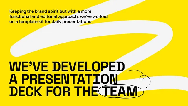
A high-contrast presentation deck cover in saturated yellow with bold black all-caps headline, flowing white abstract shapes, and a hand-drawn annotation highlighting a key phrase.
Summary
An announcement deck cover in electric yellow with large black sans-serif headline, white flowing organic shapes, and a hand-drawn circle annotation calling out one key phrase from the message.
Visual description
Bright, saturated yellow background fills the entire slide. At the top, a small paragraph of body copy in black sans-serif ("Keeping the brand spirit but with a more functional and editorial approach, we've worked on a template kit for daily presentations.") introduces the announcement. Below, white organic flowing shapes (smooth, curved forms reminiscent of ribbons or waves) intersect the yellow field from upper right to lower left, creating visual movement and layering depth. The main headline dominates the lower half in bold, black, all-caps sans-serif: "WE'VE DEVELOPED A PRESENTATION DECK FOR THE TEAM". To the right of "TEAM", a hand-drawn circular annotation in thin black lines highlights and emphasizes that final word. The composition is asymmetric but feels balanced, with shapes guiding the eye toward the annotated focal point.
Key takeaway
The contrast strategy: yellow as pure energy against white and black creates maximum readability without introducing secondary colors. The hand-drawn annotation as a simple, human touch that breaks the graphic perfection and adds emphasis without visual clutter. The flowing white shapes as a structural device that implies movement and connects disparate text zones. The all-caps oversized headline making the statement feel urgent and authoritative.
Reuse notes
Excellent for organizational announcements, company training launches, and product debuts where the message itself is the hero. The high contrast reads from a distance and works at small scale (thumbnail). Yellow/white/black palette is risky but this execution proves it works for energetic, youthful organizations. The annotation technique works best on a single, short phrase you want to emphasize; avoid overuse or the effect dilutes.
More like this






Keep what you find
A free account saves references to boards and can send you a weekly email of picks based on what you save.
To see every result, go Pro.