Preview image. Unlock full-res
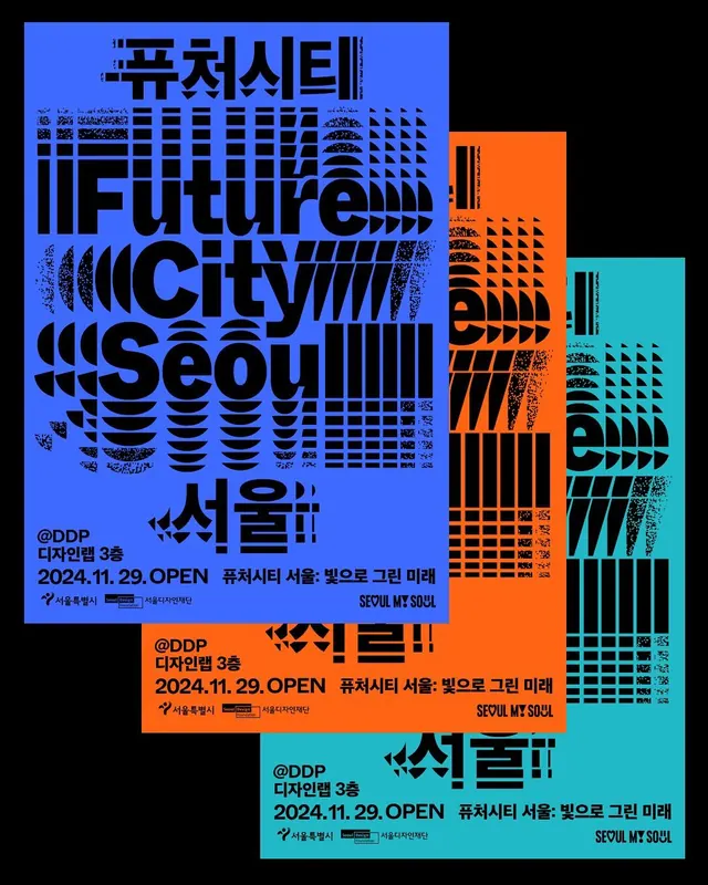
Bold typographic poster for FutureCity Seoul event promotion, layering distressed geometric grid patterns across blue, orange, and teal color blocks with dense Korean and English text.
Summary
Event promotion poster for FutureCity Seoul (2024) layering bold display typography, Korean text, distressed grid patterns, and three solid color fields (bright blue, burnt orange, teal) against black negative space.
Visual description
A high-impact collage composition on pure black background featuring three overlapping rectangular blocks: a dominant cobalt blue block (left), a burnt orange block (center-right), and a bright cyan block (right). All three are densely layered with a distressed geometric grid or checkerboard pattern created through overlapping lines and stippling, suggesting digital corruption or motion distortion. Large condensed sans-serif headlines in pure white and light teal dominate: "FutureCity Seoul" appears multiple times in both English and Korean (서울시, 퓨처시), with event details "2024.11.29 OPEN" and "SEOUL.MT.SOUL" stacked below. Additional Korean informational text in smaller scale fills remaining space. The typography is bold, purposefully crowded, and overlapped, creating visual tension and contemporary urgency. The distressed grid effects add texture and a sense of kinetic energy to an otherwise flat, geometric composition.
Key takeaway
How distressed geometric patterns add visual richness and movement to flat color-blocked compositions; the aggressive use of white and light text on dark color for maximum legibility and impact; layering typography at multiple scales and weights to create focal points without losing overall harmony; combining English and script typography densely without becoming unreadable.
Reuse notes
Strong reference for event promotion, cultural institution identity, or forward-looking brand work (tech, design, creative industries). The high contrast and bold geometry read well digitally and at poster scale. The distressed effect feels contemporary and energetic without appearing outdated. Multilingual approach works well for international or city-focused campaigns. Use caution with this density for smaller touchpoints where legibility may suffer.
More like this
Keep what you find
A free account saves references to boards and can send you a weekly email of picks based on what you save.
To see every result, go Pro.