Preview image. Unlock full-res
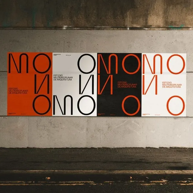
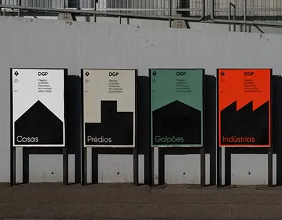
A four-panel typographic poster system with bold, modular geometric letterforms rendered in alternating red-orange, white, and black colorways against neutral concrete.
Summary
A four-panel typographic poster system with bold, modular geometric letterforms rendered in alternating red-orange, white, and black colorways against neutral concrete.
Visual description
Weathered concrete wall displaying four vertically-oriented posters arranged horizontally. Each poster shows the same geometric letterforms (large circular and linear shapes composing type) in varying color combinations: red-orange fill on white field, black outline on white, red-orange fill on black field, and red-orange outline on white. Letterforms are constructed from circles and angular strokes, creating a cohesive modular system where the same shapes recombine across the series. Small text block appears in the upper right corner of each poster. The concrete backdrop shows age and staining, emphasizing the stark clarity and modern graphicism of the type treatment.
Key takeaway
The modular shape system allows infinite combination and variation from a tight set of geometric elements. Alternating the same forms across color inversions and fills creates visual rhythm without redesigning. The oversized letterforms command attention while small supporting text grounds meaning.
Reuse notes
Strong foundation for design studio or architecture firm identity systems where geometric rigor signals expertise. The bold color makes it read well in large scale and from distance. Concrete installation suggests educational or exhibition context; adapt to posters, signage, or branding applications. Works best when the typeface itself becomes a design object, not merely a label.
More like this


Keep what you find
A free account saves references to boards and can send you a weekly email of picks based on what you save.
To see every result, go Pro.