Preview image. Unlock full-res
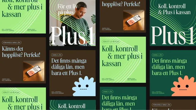
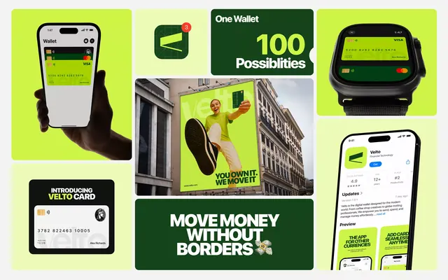
A modular grid of repeating Plus branding assets in vibrant green, cream, and orange, stacked with rounded-corner panels showing app screenshots, mascots, and taglines.
Summary
A modular grid of repeating Plus branding assets in vibrant green, cream, and orange, stacked with rounded-corner panels showing app screenshots, mascots, and taglines.
Visual description
A multi-panel composition stacked in a loose grid shows the Plus brand's design language system. Panels alternate between lime-green, cream, and dark backgrounds. The top-left panel features large white "Plus" logotype text on lime green. A portrait panel shows a person in a green shirt next to the "Plus" wordmark on cream background. An orange phone mockup displays a payment app interface. Lime-green panels contain repeated tagline text "Koll, kontroll & mer plus i kassan" and "Det finns många olika lån, men bara ett Plus i." A light-blue rounded character mascot with a simple face appears alongside dark panels. The right column shows green panels with the same repeated messaging. The color blocking creates clear visual separation while the modular rhythm establishes consistency.
Key takeaway
The use of a single repeated logotype and tagline grid to show brand flexibility across contexts. Organic rounded shapes and mascot characters soften a corporate color palette. Alternating dark and light background blocks create rhythm without additional visual complexity.
Reuse notes
Works well for fintech or payments apps wanting to show a friendly, approachable brand in a formal system. The modular grid approach is ideal for pitch decks or internal brand guidelines where you need to show multiple applications at once. Limit usage to warm color palettes with strong geometric contrast.
More like this
Keep what you find
A free account saves references to boards and can send you a weekly email of picks based on what you save.
To see every result, go Pro.