Preview image. Unlock full-res
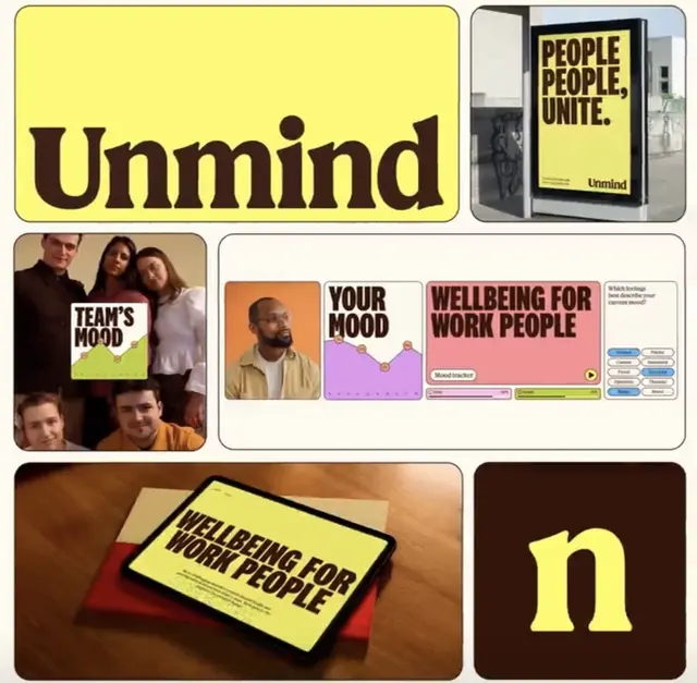
Unified brand system for workplace mental health: loud yellow typography, dark brown accents, and modular components spanning signage, mobile UI, and physical product packaging.
Summary
Unmind mental health platform brand system combining a bold yellow sans-serif wordmark, dark brown accent color, and modular UI components for workplace wellness messaging.
Visual description
Grid of six branded assets for a mental health app. Top left: oversized "Unmind" wordmark in dark brown serif on bright yellow rounded rectangle, anchored at the top. Top right: office wall poster showing the yellow and dark motif with "PEOPLE, PEOPLE, UNITE." tagline and Unmind logo. Middle left: candid photo of four diverse faces with a speech bubble overlay reading "TEAM'S MOOD" in white-on-dark sans-serif. Middle right: mobile app layout featuring a portrait photo, colorful mood-tracking line chart in purple and pink pastels, and dashboard cards with labels ("Your Mood", "Wellbeing for Work People"). Bottom left: tablet mockup on warm fabric showing the yellow poster treatment. Bottom right: dark brown background with a large soft-yellow lowercase "n" letterform.
Key takeaway
The two-color palette (high-contrast yellow and deep brown) creates visual distinctiveness across multiple mediums without complexity. The modular component approach (cards, charts, photos, type treatments) shows how to maintain brand coherence across an app interface, physical signage, and product packaging simultaneously. The use of photography and human faces balances the geometric minimalism and makes the wellness message feel approachable.
Reuse notes
Strongest for workplace wellness, mental health, and employee benefit platforms. Yellow-on-dark reads as optimistic and youthful while brown adds stability and warmth. Works well when you need the brand to span both digital interfaces and physical office environments.
More like this





Keep what you find
A free account saves references to boards and can send you a weekly email of picks based on what you save.
To see every result, go Pro.