Preview image. Unlock full-res
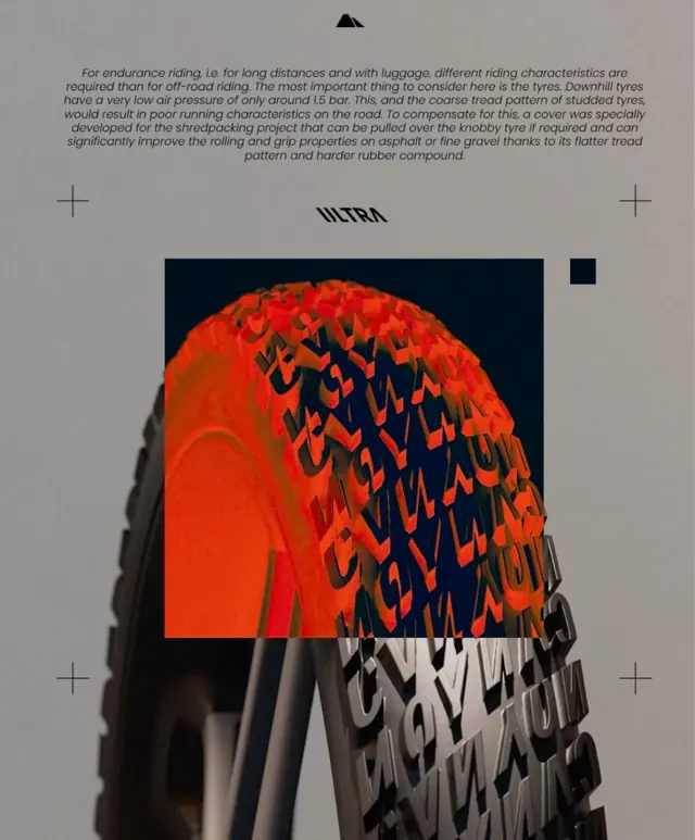
Extreme product photography of a high-performance tire tread with a neon-orange on dark background, paired with technical type and geometric grid elements.
Summary
Extreme close-up of a high-performance tire tread shot against a dark background with neon-orange highlighting the tread pattern, paired with a flat "ULTRA" wordmark and minimal geometric accents.
Visual description
A heavily lit tire tread fills the center of the composition, its surface illuminated in vibrant orange-red against a midnight-blue background. The tread pattern is sharp and textured, showing geometric interlocking treads. Type treatment is minimal, flat and technical: the word "ULTRA" sits above the tire in a bold sans-serif, with geometric plus signs and small dark rectangles scattered around the frame. The overall arrangement is sparse, relying on the intensity of the orange and dark contrast to carry visual weight. Typography is monolithic, purposefully plain next to the complex surface detail.
Key takeaway
The extreme color contrast (neon-orange on black) as a product-emphasis technique. The discipline of pairing highly complex organic texture (tire tread) with stark geometric elements (flat type, symbols) for visual balance. The minimal supporting elements that let a single product detail dominate.
Reuse notes
Strong for automotive, performance gear, or rugged-product marketing. Works when the detail itself is the hero. Requires a product with visible, interesting surface texture to avoid feeling flat. The orange-on-dark treatment suits luxury or premium positioning; avoid muddy oranges or soft palettes.
More like this



Keep what you find
A free account saves references to boards and can send you a weekly email of picks based on what you save.
To see every result, go Pro.