Preview image. Unlock full-res
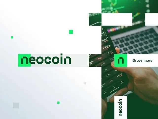
Crypto platform brand identity with oversized sans-serif logotype in black on white, bright neon green accent blocks, and fragmented smartphone/dashboard mockup imagery.
Summary
Crypto platform brand identity with oversized sans-serif logotype in black on white, bright neon green accent blocks, and fragmented smartphone/dashboard mockup imagery.
Visual description
A composition dominated by large black sans-serif type spelling "neocoin" and "n" letterforms on a bright white background. Floating over and around the text are fragmented rectangular color blocks and product photographs: a smartphone showing a trading dashboard with green accent lines, a keyboard with illuminated keys in emerald, and photos of hands interacting with the app. Small bright green squares and rectangles are scattered throughout, creating geometric rhythm. The layout uses strategic white space and overlapping elements to balance density, with the oversize type establishing primary hierarchy and the green accent color (neon shade) creating visual pop and energy.
Key takeaway
The aggressive contrast between bold oversized blackletter type and bright white space. The neon green as a single accent that ties together fragmented product photography. The overlapping mosaic approach that makes product details feel modular and explorable rather than static. The sans-serif choice (likely geometric or technical) amplifies the fintech credibility.
Reuse notes
Effective template for crypto, blockchain, and fintech brand launches where boldness and clarity matter. The neon-on-white/dark palette works especially well in dark-mode contexts (apps, dashboards). The fragmented composition suits companies that want to emphasize modularity or product flexibility. Works less well for conservative B2B verticals (healthcare, legal) without softening the palette or type weight.
More like this




Keep what you find
A free account saves references to boards and can send you a weekly email of picks based on what you save.
To see every result, go Pro.