Preview image. Unlock full-res
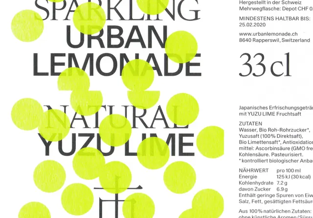
Flat beverage label design for a yuzu-lime sparkling lemonade: neon chartreuse product name in oversized stacked sans-serif occupies the left two-thirds, with dense Swiss-style ingredient and legal text in small black sans-serif filling the right column.
Summary
Flat Swiss-influenced beverage label split into a dominant left column of oversized neon chartreuse product name text and a right column of dense small-print black ingredient and legal copy on white, with "33cl" called out in large numerals.
Visual description
The label is presented flat (no cylinder distortion visible). The left two-thirds carry three stacked lines of oversized all-caps text: "SPARKLING / URBAN / LEMONADE" in the top half and "NATURAL / YUZU LIME" below it, all set in a condensed geometric sans-serif in a vivid neon chartreuse-yellow-green. Japanese kanji characters appear beneath the product name lines, smaller but in the same color. The right column is densely packed with small black sans-serif text: a volume callout "33cl" in large bold numerals near the top, followed by structured blocks of Swiss-style text covering ingredients, provenance (Rapperswil, Switzerland), production date, and legal information. The background is white throughout. Color use is strictly binary: neon chartreuse for all product-name and accent text, black for all secondary and legal text. No illustrations, imagery, or decorative elements appear.
Key takeaway
Allowing the typeface scale itself to act as the primary design element: the label is essentially a typographic poster with regulatory text appended, rather than a conventionally illustrated label. The hard two-column structure (hero type left, dense information right) solves the competing demands of shelf impact and legal legibility in one clear system. The neon chartreuse-on-white combination gives maximum luminosity without any gradient or texture.
Reuse notes
Strong reference for craft beverage, functional drink, or natural-food packaging that wants to communicate ingredient transparency without sacrificing shelf presence. The Swiss-information-hierarchy approach pairs well with a simple color system; adding a second accent color risks overwhelming the information density on the right column. Works well on cylindrical cans, flat cartons, or pouches. The Japanese text indicates dual-market positioning and hints at how to handle multilingual label requirements within the same typographic grid.
More like this





Keep what you find
A free account saves references to boards and can send you a weekly email of picks based on what you save.
To see every result, go Pro.