Preview image. Unlock full-res
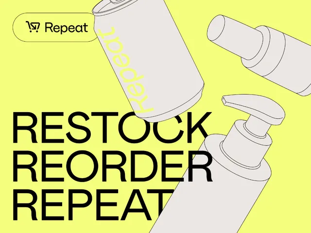
Bright yellow direct-response graphic for Repeat subscription service, highlighting the 'Restock Reorder Repeat' cycle with illustrated product bottles and instructional UI accent.
Summary
Direct-response marketing graphic for a subscription-based repeat-order service, using bold typography and flat product illustrations to communicate the automatic replenishment cycle.
Visual description
Vibrant yellow background fills the frame. In the upper left, a small pill-shaped button with black text icon reads "Repeat." Angled product illustrations (pump bottles, jars, spray bottles) in neutral beige line-weight sketches angle across the right side of the frame. The left and bottom three-quarters of the composition are dominated by oversized black sans-serif all-caps text reading "RESTOCK / REORDER / REPEAT" in three left-aligned lines. The descenders and round letterforms of the typeface appear bold and contemporary. Subtle yellow accent striping runs vertically down one bottle, and the overall composition balances chunky typography against spaced-out product illustrations.
Key takeaway
The simplicity of repeating a core message in three lines (Restock, Reorder, Repeat) creates a memorable mantra. Using product illustration (not photography) keeps the composition light and scalable. The yellow background with black type delivers maximum contrast and readability for mobile or small-scale applications. The Repeat button in the corner serves as a subtle brand mark that doesn't compete with the headline.
Reuse notes
Effective for subscription or recurring-order businesses (beauty, groceries, meal kits, consumables). The stark yellow and black work especially well as social-media assets or email hero images where high contrast cuts through feed noise. Best suited to products with simple, recognizable silhouettes; complex product illustrations lose their clarity at smaller scales.
More like this



Keep what you find
A free account saves references to boards and can send you a weekly email of picks based on what you save.
To see every result, go Pro.