Preview image. Unlock full-res
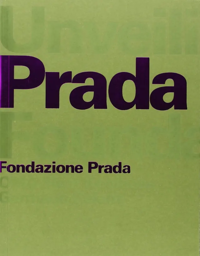
A bold branding presentation featuring large "Prada" wordmark in purple on chartreuse-green background, with "Fondazione Prada" subheading.
Summary
A bold luxury branding composition featuring "Prada" in large purple sans-serif type on a chartreuse-green background, with "Fondazione Prada" text below.
Visual description
A vertical composition on a bright yellow-green (chartreuse) background displays "Prada" in massive dark purple sans-serif type, dominating the upper two-thirds. The wordmark is letterforms with generous spacing. Below, in smaller purple text, reads "Fondazione Prada". The background has subtle texture or pattern suggesting a lithograph or printed medium. The extreme color contrast between the vibrant green and deep purple creates striking visual impact. The typography is clean and geometric, suggesting a modern luxury aesthetic. No additional graphic elements or imagery present.
Key takeaway
Unexpected, saturated color combinations in branding create memorable, distinctive visual identity. The extreme contrast ensures legibility while the saturated hues convey contemporary luxury positioning.
Reuse notes
Excellent reference for luxury fashion and contemporary brand identity systems. The duotone approach works for high-end brand positioning and stands out in competitive market contexts. The chartreuse-purple combination is unusual and strongly associated with contemporary design. Useful for mood boards exploring bold luxury aesthetics and color theory applications in branding.
More like this



Keep what you find
A free account saves references to boards and can send you a weekly email of picks based on what you save.
To see every result, go Pro.