Preview image. Unlock full-res
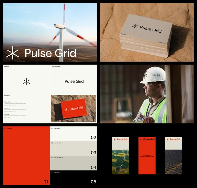
Renewable energy company brand identity combining a minimalist asterisk logo with bold color blocking and real-world application showcases across infrastructure and field photography.
Summary
Multi-panel brand identity system for Pulse Grid, a renewable energy company, showing a geometric asterisk mark, structured grid layouts, and the identity applied to physical assets in the field.
Visual description
Six-panel brand presentation grid. Top left shows the asterisk wordmark centered over a wind turbine in a natural landscape. Top right displays the mark embossed on kraft-paper business cards in natural light. Middle panels show a formal brand-book spread with the asterisk symbol, logotype lockup, brand guidelines sections labeled Sustainability and Reliability, and color swatches. Bottom panels display the mark applied to a construction hardhat, printed on a bright red card against sandy earth, and as small icon variations. The color palette balances warm earth tones (tan, dark brown) with a high-impact red accent against light backgrounds and near-black text.
Key takeaway
The asterisk as a distinctive mark readable at all scales. The strategy of showing the mark three ways: clean (on paper), environmental (on physical objects in use), and variation (icon set). The disciplined two-color story (warm neutrals plus single energy-red).
Reuse notes
Strong for infrastructure, energy, or enterprise brands needing to establish credibility and field-ready application. The earthy color palette works well for sustainability-focused companies. Real-world context shots build confidence in production quality.
More like this






Keep what you find
A free account saves references to boards and can send you a weekly email of picks based on what you save.
To see every result, go Pro.