Preview image. Unlock full-res
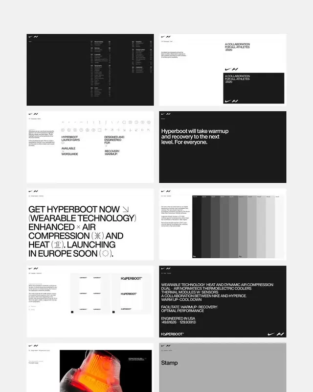
A dark-mode design system showcase for a wearable fitness device, displaying multiple black and white screens with dense information hierarchy, sans-serif typography, and warm accent colors for callouts.
Summary
A multi-panel design system documentation for Hyperboot, a wearable recovery platform, covering navigation, typography, icons, product marketing, and UI screens in a consistent dark-mode visual language.
Visual description
Grid of 9 design system documentation panels on light gray background. Top-left: dark UI menu interface with white text and symbols. Top-center and adjacent: dark card showing "A COLLABORATION FOR ALL ATHLETES (2025)" with light heading on dark background. Top-right: purple accent color swatch on white. Second row left: dark interface showing dense menu items and icons with typography specifications. Center: white panel with product messaging "Hyperboot will take warmup and recovery to the next level. For everyone." in dark large type. Right: orange and purple gradient swatch cards. Bottom rows: more dense documentation showing sans-serif font families, icon sets (line-based symbols), and product copy with technical specifications ("ENGINEERED IN USA 4.0516926 1293.3313"). Throughout: consistent use of black, white, light grays, with warm orange accent for emphasis. All typography in condensed sans-serif, often all-caps.
Key takeaway
The systematic approach to dark-mode UI documentation. Each screen demonstrates hierarchy through contrast (bright white text on pure black) rather than color. The limited accent color (warm orange) appears strategically to direct attention. Condensed all-caps type and tight line-height make dense information scannable. Icon system and typeface specs show modularity. Product narrative ("warmup and recovery") integrates seamlessly with technical data.
Reuse notes
Essential reference for designing dark-mode wearables or fitness tech. The high-contrast approach is technically sound for small screens and outdoor visibility. Works for any product requiring dense technical documentation alongside consumer messaging. The orange-on-black accent pattern is effective for action items and warnings.
More like this

Keep what you find
A free account saves references to boards and can send you a weekly email of picks based on what you save.
To see every result, go Pro.