Preview image. Unlock full-res
B2B research presentation layout combining data personality profiles, research persona cards, analytics charts, and user goal/needs sections in a mint-and-lime color system.
Summary
Research presentation layout blending persona cards, data visualizations, and data-informed insights through a minimal card grid, using muted greens and lime accents to organize distinct research findings and user profiles.
Visual description
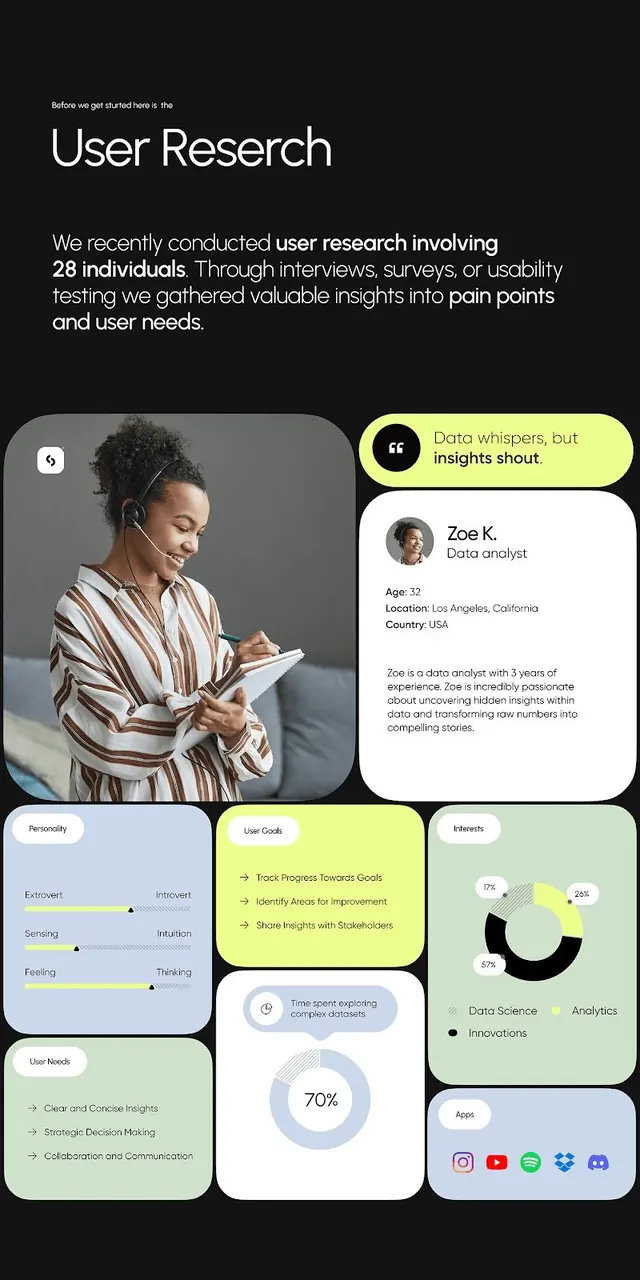
A dark background frames the mobile-first presentation layout. The top introduces the research scope with headline typography and a paragraph describing user research conducted with 28 individuals via interviews, surveys, and usability testing. Below, a large circular portrait photograph of a woman with a headset sits alongside a white rounded card introducing "Zoe K., Data Analyst" with biographical details and a yellow-green callout quote. Below this hero pairing, a grid of smaller rounded cards contains: a blue personality spectrum card (Extrovert/Introvert, Sensing/Intuition, Feeling/Thinking axes), a lime-green "User Goals" card with bullet points, a pale green pie chart labeled "Interests" showing Data Science (57 percent), Analytics, Innovations proportions, and a white "User Needs" card with further bullets. At the bottom, a light blue donut chart shows "Time spent exploring complex datasets" at 70 percent. All cards are white or subtly tinted in pale green, lime, or blue, with dark navy text. Icons (speech bubbles, pie-chart symbols) add visual rhythm without clutter.
Key takeaway
The card-stacking pattern lets you present multiple data types (quotes, persona traits, metrics, goals, needs) without overwhelming the viewer. The lime-green accent color on specific cards (goals, interests) creates visual hierarchy through strategic color placement rather than size. The portrait plus biographical card grounds abstract data in human reality. Rounded corners and breathing space (white backgrounds against dark) signal approachability despite data density.
Reuse notes
Powerful for B2B SaaS, analytics platforms, research consultancies, or UX teams presenting user insights to stakeholders. The persona + supporting data layout is particularly effective for demonstrating research rigor and user-centered thinking. Works best with a limited accent color (lime or yellow) to punctuate key sections; the cool, muted palette avoids distraction. This layout scales well for presentation decks, product briefs, or internal research documentation where human-centered data storytelling matters.