Preview image. Unlock full-res
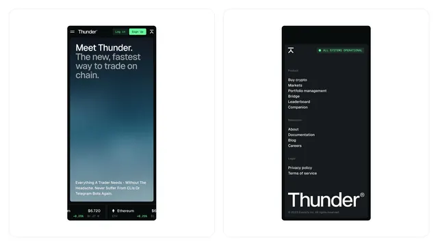
Mobile app mockup pair for Thunder crypto trading platform showing dark-mode hero screen and side-navigation menu with lime-green accent buttons and operational status.
Summary
Two mobile mockups for Thunder, a crypto trading app, showing a dark-mode hero screen with speed-focused copy and a navigation menu with feature categories and operational status indicator.
Visual description
Left screen: Dark navy-blue background with a teal-to-navy gradient creating depth. The headline "Meet Thunder. The new, fastest way to trade on chain" appears in light gray and white sans-serif, with supporting copy below in smaller teal text. Two buttons—"Log in" and "Sign Up" in bright lime green—sit prominently. Market ticker data (prices, percentage changes) appears at the bottom. Right screen: Dark navy background with a hierarchical navigation menu listing product features (Buy crypto, Markets, Portfolio management, Bridge, Leaderboard, Companion), resources (About, Documentation, Blog, Careers), and legal (Privacy policy, Terms of service). An all-caps system status line reads "ALL SYSTEMS OPERATIONAL" with a green indicator dot. The Thunder logo anchors the bottom. Both screens are framed in white phone bezels against a light gray background.
Key takeaway
The restrained two-button CTA strategy (Log In, Sign Up in high-contrast lime) that commands attention without clutter on a speed-focused hero. The hierarchical navigation grouping (Product / Resources / Legal) that creates instant scannability. The operational-status indicator as a trust signal for financial/crypto audiences. The teal accent color breaking the cold navy palette just enough to suggest activity.
Reuse notes
Strong foundation for crypto exchanges, DeFi platforms, or fintech apps prioritizing speed and security messaging. The dark palette suits 24/7 trading interfaces and appeals to crypto-native users. The operational status pattern is essential for trading apps and other mission-critical services. Navigation hierarchy works for apps with many features; adapt the category labels to your product. The lime-green accent is high-energy; soften to electric blue or cyan if a calmer tone is needed.
More like this

Keep what you find
A free account saves references to boards and can send you a weekly email of picks based on what you save.
To see every result, go Pro.