Preview image. Unlock full-res
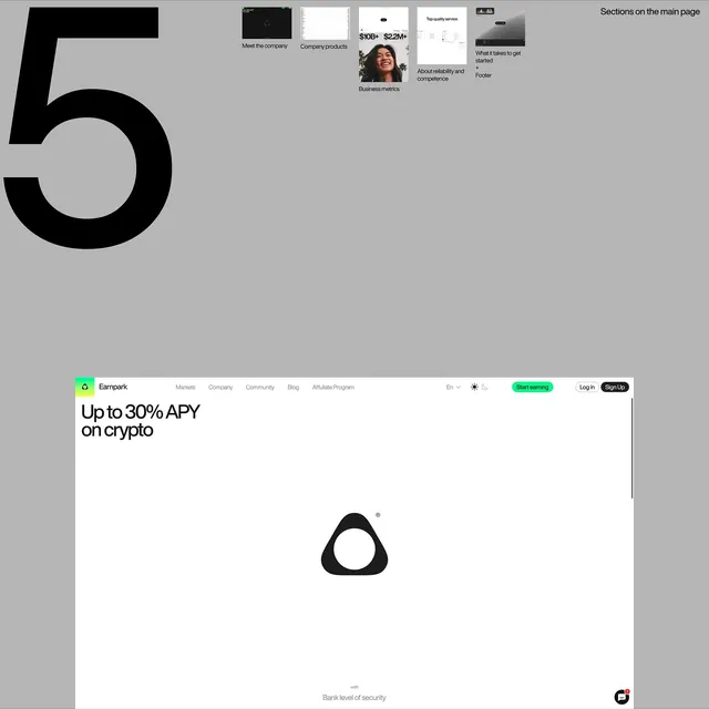
Fintech landing page combining a dominant oversized number five with a product website section grid and hero headline promoting cryptocurrency yield, using monochromatic palette and minimal navigation.
Summary
A fintech product page split into an upper design-system showcase and a lower hero section that leads with oversized numerals and a high-yield offer, anchored by a minimal symbol logo and security callout.
Visual description
The upper section displays a light-gray background with a large black numeral "5" and a grid of eight website section mockups in small scale: navigation templates, product spreads, pricing cards, testimonial sections, business metrics, footer designs, and related page modules. The lower section is the actual product landing page with a clean white background. A minimal top navigation includes "Empark" logo (green circle with outline), navigation menu (Markets, Company, Community, Blog, Affiliate Program), language toggle, theme switcher, and dual buttons (Start earning in bright green pill, Log In, Sign Up in outline). The hero headline reads "Up to 30% APY on crypto" in bold black sans-serif. Below, a simple black triangular logo symbol with a white cutout center sits prominently in the middle. Fine print at the very bottom reads "Bank level of security" in gray. The overall composition uses stark monochromatic contrast with a single bright-green accent for the call-to-action.
Key takeaway
The oversized numerals or abstract shapes as compositional anchors that draw the eye without requiring visual decoration. The two-tier layout showcasing design-system inventory above the actual product demonstrates confident hierarchy. The single accent color (bright green) against pure monochrome makes the CTA unmissable. Minimal branding (symbol-only logo) conveys sophistication and trust in the fintech space.
Reuse notes
Ideal for blockchain, cryptocurrency, or fintech platforms that need to communicate security and clarity. The stark black-and-white palette reinforces trustworthiness and technical expertise. The green accent works for yield-focused messaging but can be swapped for brand colors. Not suited to lifestyle or consumer-app positioning; requires product substance to justify the austere aesthetic. The section-grid above works well when communicating platform scope or design consistency.
More like this


Keep what you find
A free account saves references to boards and can send you a weekly email of picks based on what you save.
To see every result, go Pro.