Preview image. Unlock full-res
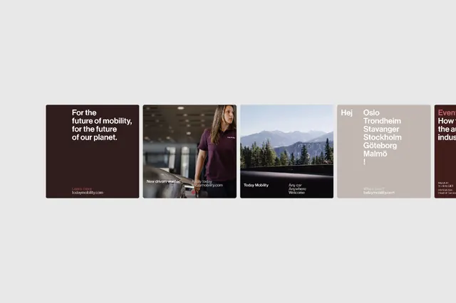
A five-tile editorial grid mixing photography, text, and logotypes with overlapping transparent text overlays in a cohesive muted-color brand system.
Summary
A five-tile editorial grid mixing photography, text, and logotypes with overlapping transparent text overlays in a cohesive muted-color brand system.
Visual description
Five square or nearly-square tiles arranged horizontally in a single row, each containing a different visual approach: the first tile is a dark chocolate brown with white display type ("For the future of mobility, for the future of our planet") plus a small logotype; the second shows a close-up photograph of hands on machinery with dark text overlay; the third features a landscape photograph of a snowy mountain range with "Today Mobility" and "Any Car Anywhere" text; the fourth is a soft taupe background with city names stacked in a serif-like font (Oslo, Trondheim, etc.); the fifth is a dark burgundy-red with white text partially cut off by the frame edge. All tiles share a consistent typography system and appear to use the same dark text color over light backgrounds or reversed-out white text over dark. The overall composition emphasizes clean, orderly layout with information hierarchy through size and placement rather than visual decoration.
Key takeaway
Mixing photography, flat color, and type-only tiles within one system gives flexibility while maintaining cohesion. The transparent text overlays on photography create depth and branded language without obstructing the underlying image. The consistent use of a limited color palette (dark brown, taupe, white, minimal accent red) across varied visual treatments creates a recognizable brand presence that feels contemporary and editorial without trendy decoration.
Reuse notes
Strong for B2B or mobility-sector campaigns where serious, professional tone matters. The editorial grid works well for multi-part campaigns (campaign tiles, social carousel, web gallery). Photography tiles work particularly well when the subject matter (manufacturing, landscapes, urban scenes) reinforces the brand message. Avoid this approach if your audience is young or expects vibrant color; the muted palette reads as mature and established.
More like this





Keep what you find
A free account saves references to boards and can send you a weekly email of picks based on what you save.
To see every result, go Pro.