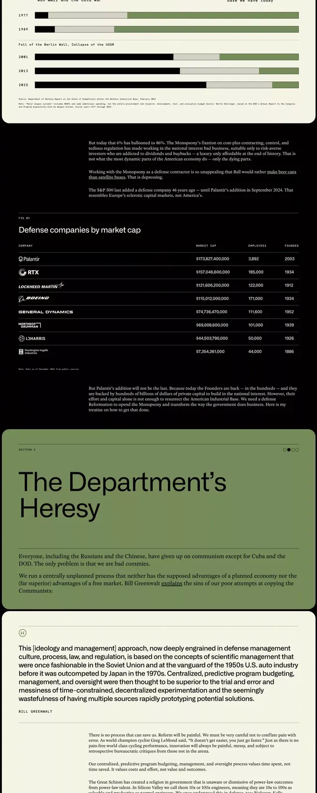
Preview image. Unlock full-res
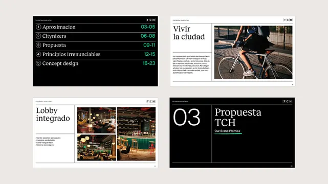
A multi-page document layout showcasing clean typography, structured sections, and muted sage-green and gray palette for formal corporate or policy reporting.
Summary
A multi-page document layout system featuring structured typography, generous white space, and a muted sage-green accent color throughout sections covering governance, policy, research, or corporate reporting content.
Visual description
A vertically stacked composition of multiple pages showing document design. Pages feature generous left and right margins with justified body copy in dark gray or black. Section headers use a larger, bold sans-serif in dark text or sage-green. Subheadings introduce new topics with clear hierarchy. The palette is limited to off-white or cream background, dark gray/black text, and sage-green for accent elements (section dividers, initial letters, highlight bars). Pages include data tables with clean grid lines in muted tones, charts or diagrams rendered in the same muted palette, and consistent spacing between sections. Typography is clean, legible, modern sans-serif with sufficient leading for dense text. Green accent bands or indicators break up text-heavy layouts without overwhelming the formal tone.
Key takeaway
The restrained color palette and reliance on typography and white space creates authority and readability without decoration. The sage-green accent is strategic and reusable across pages without appearing playful. The clear section hierarchy (title, subheading, body, data) makes complex information digestible. The use of pull-quotes, initial letters, or highlight bars breaks monotony in text-heavy layouts while maintaining professionalism.
Reuse notes
Essential reference for corporate reports, governance documents, policy briefs, nonprofit impact statements, or academic papers. Works well when conveying serious, formal, or official information. Particularly strong for B2B communication or internal documentation. Pair with projects prioritizing clarity and authority over visual flourish. The muted palette is culturally neutral and professional across contexts. Avoid when your audience expects warmth or play; this system signals officialdom.
More like this

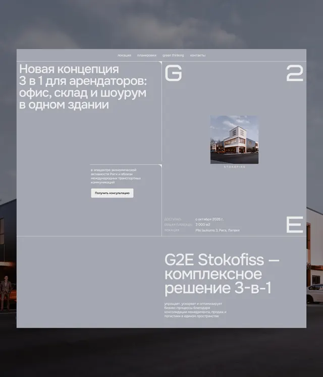

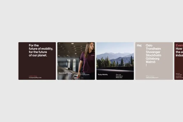


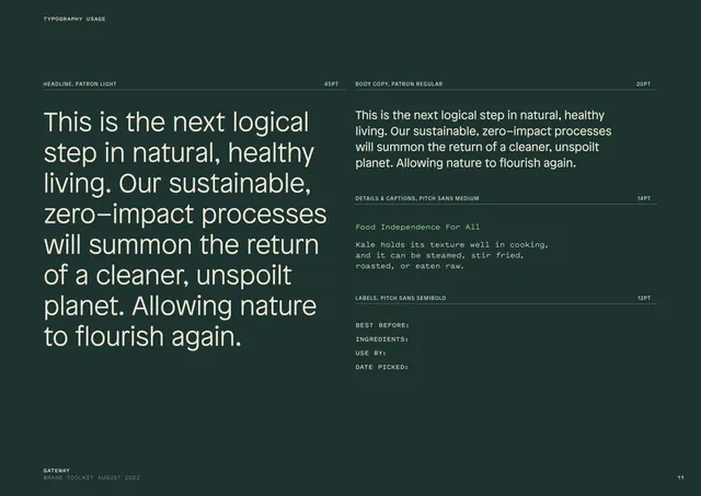


Keep what you find
A free account saves references to boards and can send you a weekly email of picks based on what you save.
To see every result, go Pro.