Preview image. Unlock full-res
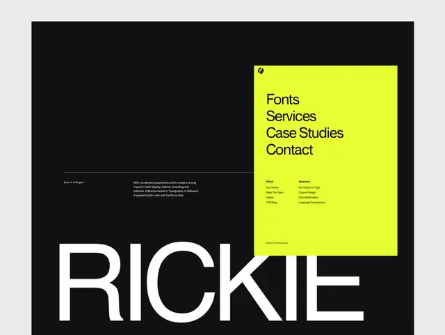
A bold branding and website layout featuring the Rickie studio name in large sans-serif type with neon yellow navigation panel against black.
Summary
A bold branding composition for Rickie design studio featuring oversized sans-serif typography and a neon yellow navigation panel against a black background.
Visual description
A large square design is divided into distinct areas. The dominant element is the word "RICKIE" in enormous white sans-serif letters in the lower left, occupying roughly a quarter of the visible space. Above and to the right is a bright neon yellow square panel containing navigation text reading "Fonts", "Services", "Case Studies", and "Contact" in black sans-serif. Below the navigation are smaller sections with "About" and "Approach" headings with supporting text. The background is pure black. The composition uses extreme color contrast and bold geometric division. The typography is clean, modern, and supremely confident.
Key takeaway
The extreme color contrast of neon yellow against black is arresting and memorable. The oversized studio name establishes immediate brand identity and confidence. The segregation of navigation into a geometric panel creates visual clarity and hierarchy without complexity. The overall effect is bold and contemporary.
Reuse notes
Excellent for design studio, creative agency, and portfolio branding. Strong for contemporary brand identities emphasizing visual boldness and minimalism. The geometric color blocking technique applies to any brand communication seeking striking impact. Works well for website design and print collateral. The neon color treatment modernizes any brand and signals creative confidence.
More like this




Keep what you find
A free account saves references to boards and can send you a weekly email of picks based on what you save.
To see every result, go Pro.