Preview image. Unlock full-res
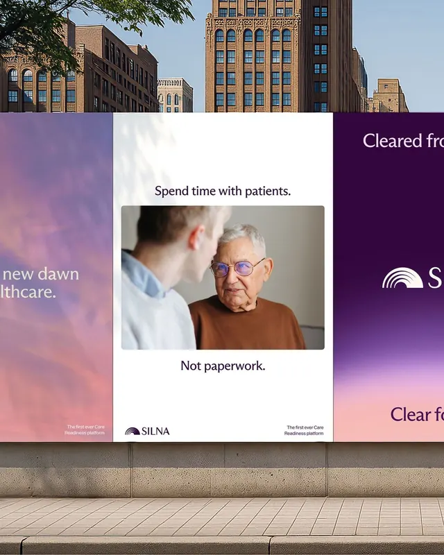
Billboard mockup for SILNA healthcare platform using soft mauve-pink gradients flanking a white center panel with portrait photography and care-focused messaging.
Summary
A healthcare billboard campaign balancing corporate professionalism with human-centered messaging through soft gradient flanks, central portrait, and patient-first copy.
Visual description
The design features a horizontal three-part composition: a soft mauve-pink gradient panel on the left, a clean white center section, and a darker purple-gradient panel on the right. The white center holds two text lines in clean sans-serif ("Spend time with patients" as the headline, "Not paperwork" below) and a centered portrait photograph of an older man wearing glasses in conversation. Urban architecture (tall buildings, blue windows) frames the top third as context. Small text and SILNA branding anchor the bottom edges. The overall effect is warm, inviting, and serious through the contrast of soft color gradients against the neutral human subject and functional messaging.
Key takeaway
The use of complementary gradient flanks to add sophistication without overwhelming the central portrait and message. The gentle warm palette (mauve, beige, muted brown) conveying care and trustworthiness for healthcare. The horizontal golden-ratio composition with negative space preserving focus on the portrait and two-line copy.
Reuse notes
Effective for healthcare, wellness, or professional-services billboard campaigns that need to balance corporate messaging with empathy. The portrait placement and soft palette work well for platforms emphasizing human relationships over administrative burden. Scale to large formats; the clarity of the two-line copy is the main driver. Works equally well in digital and outdoor contexts.
More like this




Keep what you find
A free account saves references to boards and can send you a weekly email of picks based on what you save.
To see every result, go Pro.