Preview image. Unlock full-res
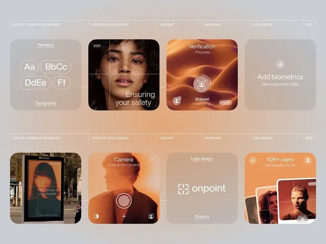
Modular card grid showing identity verification, AI processing, biometric data, and account onboarding flows with warm peach gradients and portrait photography.
Summary
Two-grid product showcase for Onpoint identity verification app, with modular rounded-corner cards displaying feature flows, real photography, soft peach-to-orange gradients, and labeled service categories at the top.
Visual description
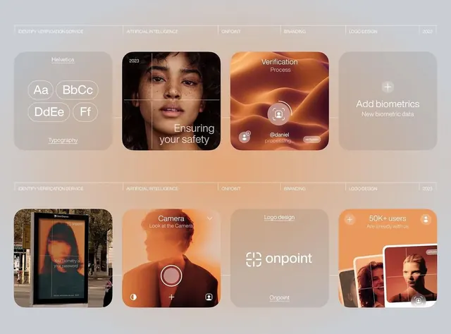
Two horizontal grid rows of cards (6 cards total) on a neutral beige background. Each card is rounded-corner and contains either full-bleed portrait photography or interface patterns with soft peach and warm-orange gradients overlaid. Top row left: typography specimen with oversized sans-serif character examples. Top row center: portrait photo of a person facing camera with grid overlay and "Ensuring your safety" copy. Top row right: abstract warm gradient with circular icon and "Verification Process" text. Top row far right: plus-icon placeholder for "Add biometrics." Bottom row shows: outdoor photo of a displayed screen, a portrait with interface icons for camera activation, a beige card with "onpoint" logotype, and an orange card with small user photo and "50K+ users" stat. Category labels (IDENTITY VERIFICATION SERVICE, ARTIFICIAL INTELLIGENCE, ONPOINT, BRANDING, LOGO DESIGN, 2023) sit above both rows in light gray caps. No heavy shadows or bevels; soft edges and color transitions create warmth.
Key takeaway
Modular card systems with asymmetric content (text, photo, gradient, UI) feel modern and scalable. The warm peach-to-orange gradient palette reads as friendly and trustworthy without being saccharine, especially when applied over photography. Rounded corners and soft contrast between cards and background make the layout approachable. Mixing real people photography with interface patterns shows product in human context, building credibility for identity/security-focused apps.
Reuse notes
Core pattern for fintech, identity verification, and security products. The warm palette works well when trust and ease-of-use are the brand message, less so for austere or high-security positioning. The photo overlays require good subject contrast; test with your imagery. Useful for landing pages, feature comparisons, or product walkthroughs. Extend by adding more cards or reducing the grid to a single row for hero sections.
More like this
Keep what you find
A free account saves references to boards and can send you a weekly email of picks based on what you save.
To see every result, go Pro.