Preview image. Unlock full-res
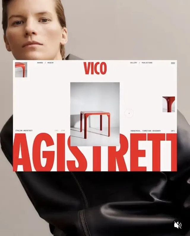
A portfolio layout overlaying a bold red sans-serif headline and furniture hero image onto a naturalistic portrait photograph.
Summary
A minimalist designer portfolio that layers a bold red headline and furniture product image over a centered portrait photograph of a designer in a neutral jacket.
Visual description
The composition stacks three layers: a natural-toned studio portrait of a person centered at the top, a white card with VICO branding and a red furniture product image in the middle, and a large red sans-serif headline (AGISTRETT) anchoring the bottom. A slim navigation bar tops the card with linked sections like "Awards" and "Gallery." Small supplementary text on the card identifies the designer as an "Italian Architect" and "Industrial Furniture Designer." The color palette stays restrained: warm grays, clean white, natural skin tones, and a single striking red that commands the headline and product image. The overall effect is editorial and controlled, treating the portfolio as a physical publication laid over portraiture.
Key takeaway
The bold red used sparingly as a headline accent creates high impact against the neutral portrait. The layered composition (portrait, then card overlay, then headline) creates visual depth and editorial sophistication. The minimal horizontal navigation and product-focused grid show how to present a designer's work with restraint.
Reuse notes
Ideal for design-studio portfolios, furniture or industrial-design showcases, or any case where a designer's image and work can be presented together. Works best with striking product photography and strong typography. The red-and-white palette is effective for luxury goods and editorial contexts; swap the accent color for other brands. Requires centered composition and portrait-photography quality.
More like this


Keep what you find
A free account saves references to boards and can send you a weekly email of picks based on what you save.
To see every result, go Pro.