Preview image. Unlock full-res
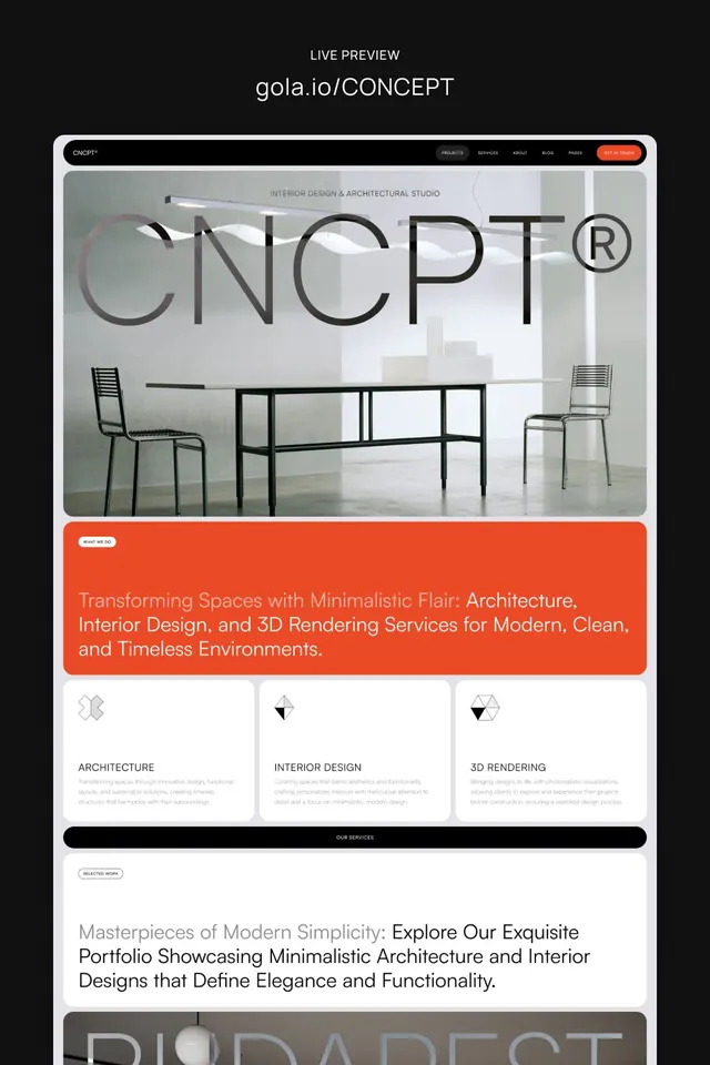
A website mockup for an interior design and architecture studio with a large wordmark overlaid on minimalist furniture imagery, red accent bar with service categories, and portfolio section below.
Summary
A portfolio website mockup for an interior design and architecture studio, featuring an oversized wordmark typography treatment layered over minimalist furniture photography and three service categories separated by a bold red accent panel.
Visual description
Full-page website mockup on a light gray background. At the top is a navigation bar with the studio name, navigation links, and a red "GET IN TOUCH" button. The hero section features a centered photograph of a minimalist interior space with simple black-metal chairs and a table on light flooring. Overlaid in large, bold sans-serif capitals is the studio name "CONCEPT" with a registered trademark symbol, the letterforms transparent/outlined, creating dramatic layering between type and imagery. Below the hero image is a prominent red-orange accent bar containing white body copy describing the studio's services in 1-2 sentences. Below that are three equal-width service cards in white boxes: "ARCHITECTURE," "INTERIOR DESIGN," and "3D RENDERING," each with gray supporting copy. A black footer bar labeled "OUR SERVICES" spans the width, followed by a "SELECTED WORK" section and additional portfolio content, visible at the bottom.
Key takeaway
Oversized transparent typography layered directly over photography creates premium, editorial visual impact without obscuring the underlying image. The bold color accent bar (red-orange) provides visual momentum and CTA emphasis without competing with the type-and-image hierarchy. Three equal service cards below a dramatic hero establish credibility and clarity, a pattern that scales to portfolios, agency sites, and product categories. The color palette is restrained: black, white, and a single vibrant accent, making the composition feel both contemporary and timeless.
Reuse notes
Effective for design studios, architecture firms, interior design agencies, and creative portfolios. The large wordmark approach works well for premium brands; ensure the overlaid type remains legible with strong contrast or opacity adjustment on the underlying image. The red accent bar is particularly effective for CTAs or section breaks, but should be reserved for one primary action to maintain hierarchy. The three-card pattern below scales to feature categories, service offerings, or case study previews. Minimal photography (clean, architectural, light) is essential to this composition working.
More like this


Keep what you find
A free account saves references to boards and can send you a weekly email of picks based on what you save.
To see every result, go Pro.