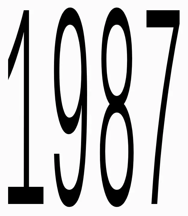
1001 large display typeface specimen

1001 large display typeface specimen, geometric, minimal, monochrome

Preview image. Unlock full-res

Bold display typeface showing the numbers 1001 in large black letterforms demonstrating thick and thin stroke contrast on white background.

Summary

A typographic specimen displaying the number sequence 1001 in a bold geometric sans-serif typeface with dynamic stroke weight contrast rendered in black against white.

Visual description

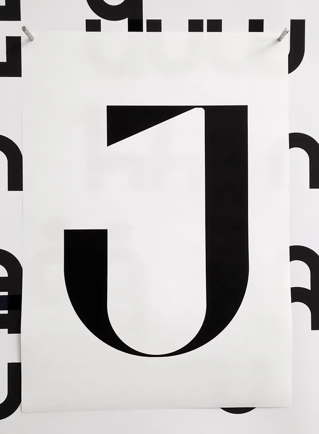
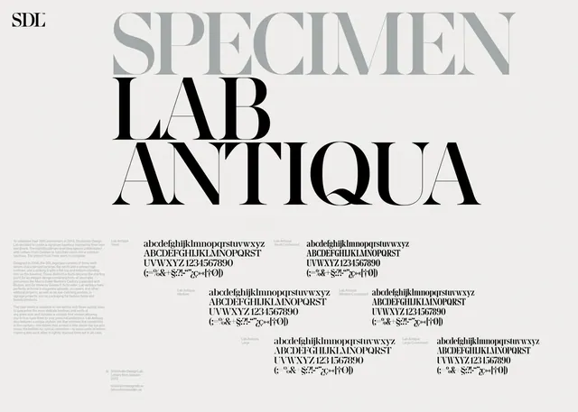
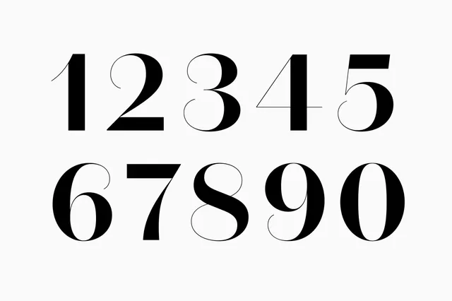
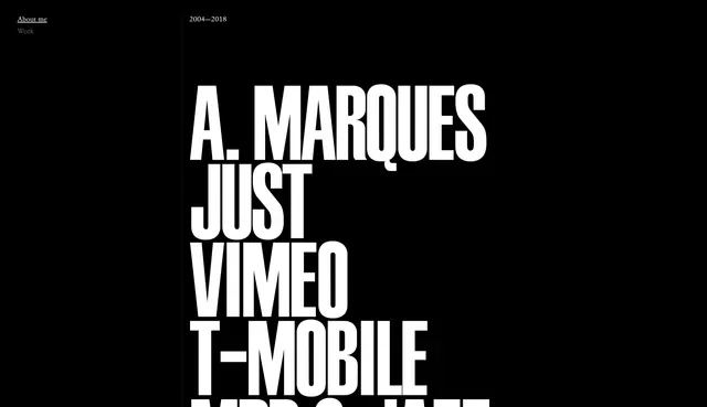
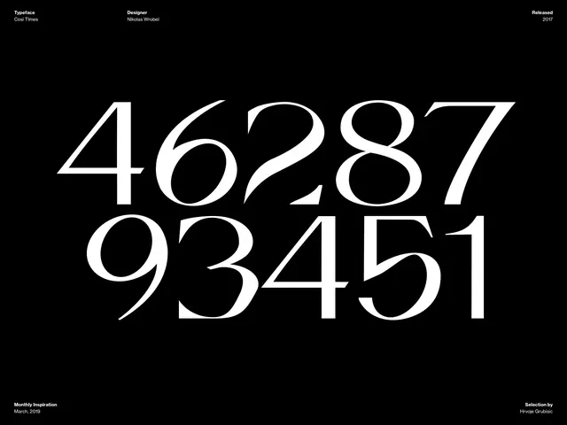
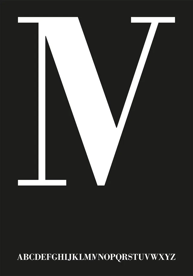
Pure black bold numerals on bright white background. The numbers 1, 0, 0, 1 are displayed at large scale showcasing the typeface's character. The first numeral "1" is rendered with a distinctive serif bracket at the base and diagonal stroke creating visual rhythm. The two zeros feature pronounced thick counter spaces and dynamic curves. The final "1" displays an angled cut at the top, creating asymmetrical interest. Stroke weights vary across letterforms, creating visual dynamism. The composition is centered and generous, allowing each form to command attention. The typeface demonstrates geometric construction with smooth curves and clean terminations. The black and white contrast creates maximum legibility and impact suitable for signage or display applications.

Key takeaway

Large-scale numerals demonstrate typeface character more effectively than text strings. Variable stroke weight creates visual interest and movement. Geometric construction communicates contemporariness and precision. Display typefaces benefit from generous sizing to showcase sculptural letterforms.

Reuse notes

Excellent reference for typeface specimens, font foundry presentations, or design education materials. The direct approach focuses on letterform geometry without distraction. Suitable for posters, signage, or exhibition contexts. The bold monochromatic treatment works well for both print and digital applications. Effective for showcasing custom or display typefaces to clients or communities.

More like this