Preview image. Unlock full-res
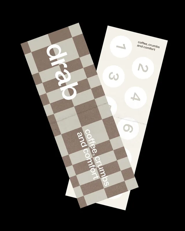
Rotated menu cards for a coffee shop using a two-tone checkerboard pattern with minimal typography and numbered layout.
Summary
Two rotated menu cards using a tan and brown checkerboard pattern, with minimal text and numbered item slots arranged on a cream background.
Visual description
Black background showing two rotated card designs side by side. Left card features a large tan-and-brown checkerboard pattern with white vertically-oriented text reading "coffee" at the center. Right card has a solid cream background with the text "coffee, crumbs and comfort" in the top right, followed by five numbered circles (1 through 5) arranged vertically in the middle, plus a "6" near the bottom. The geometric checkerboard on the left contrasts sharply with the minimal, open right card. Both pieces use small, clean sans-serif type and maintain an earthy, warm color palette of cream, taupe, and coffee-brown tones.
Key takeaway
The checkerboard as a bold yet organic accent pattern that pairs playfully with minimal type. The asymmetric two-card comparison layout gives rhythm and invites interaction. Using numbered slots instead of explicit menu items creates a flexible placeholder system.
Reuse notes
Strong for cafes, restaurants, and food-service menus where a craft or personality fits the brand. The warm earth tones and checkerboard read friendly and approachable. The numbered approach is reusable for seasonal specials or rotating selections. Works at small print size (cards, coasters) or larger display.
More like this

Keep what you find
A free account saves references to boards and can send you a weekly email of picks based on what you save.
To see every result, go Pro.