Preview image. Unlock full-res
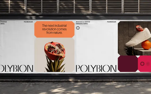
Industrial storefront signage balancing earth-toned photography, geometric color blocks, and clean sans-serif branding against a bright neutral ground.
Summary
A storefront layout for natural/science-forward brand blending photographed botanical and food elements, minimal typography, and a restrained earth-tone palette in a structured grid.
Visual description
The composition presents a horizontal banded storefront divided into quadrants and asymmetric zones. The left third opens to horizontal metal-slat louvers (cream and dark timber tones), a visual anchor of industrial, architectural texture. A three-color palette block (deep plum, terracotta, and olive) occupies the lower left. The center and right feature layered product photography: a close-up of flowers in bloom, a minimal still-life with a pot and fruit, and a deep maroon companion color swatch. The brand name, set in clean sans-serif capitals, appears twice in confident sizing. The overall ground is a cool, high-key off-white. Every element is organized on an implicit grid, with breathing space and clear visual hierarchy.
Key takeaway
The integration of natural photography with geometric color systems without kitsch or decoration. The textural louver detail lending credibility and craft. The deliberate color-swatch notation (real material references) paired with clean typography as a branding system. The restrained palette that reads expensive and intentional.
Reuse notes
Excellent for natural-product, cosmetics, food-science, or wellness brands seeking premium, modern positioning. The industrial-meets-organic gesture feels contemporary without trend-debt. Works at scale for retail environments, packaging systems, and digital brand expression. Requires strong, genuinely beautiful product or botanical photography to sustain.
More like this






Keep what you find
A free account saves references to boards and can send you a weekly email of picks based on what you save.
To see every result, go Pro.